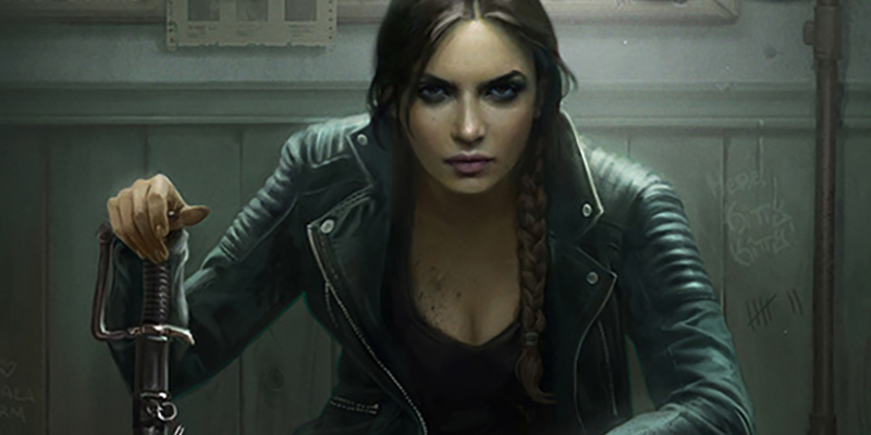
Happy Monday! Thank you for all of your coffee grinder suggestions. I pulled the trigger on a more pricy conical grinder which should be great for drip coffee and will report on the results.
I’d love to hear about HA’s cover design process. What determines whether you use one of your cover artists and whether Ilona crafts it? What creative process and tools does Ilona use when she creates the cover? What process do you like best (cover artist who uses live models, cover artist who uses database images, creating your own, etc.)?
The primary factors in whether I make the cover or we hire an artist are cost, availability, and branding.
COST
Good covers are expensive, because artists deserve to be fairly compensated for their work. We are much more likely to invest in art on a longer work or an anthology than on a short story or a novella. Novellas are cheaper, they earn less than a full release, and therefore, cover cost becomes a larger percentage of the budget.
This is also affected by branding. More on it in a minute.
You can see this cost factor in action on some of our older Ace novellas. They used to be part of an anthology, for which the publisher had commissioned a cover. Then the anthologies were split into eSpecials.
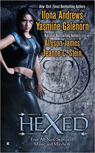
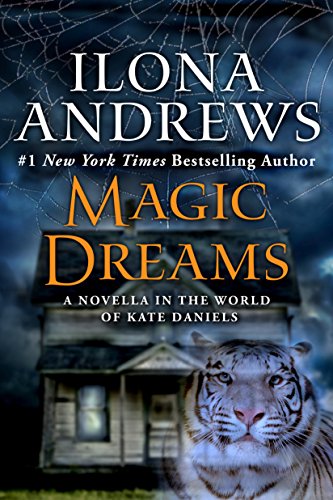
As you can see, the eSpecial was clearly put together with stock images probably by the publisher’s art department. I’d estimate the cost of images to be under $150.
Who puts the cover together can make a difference even when stock images are used.


There is no drop of quality even thought the novella uses stock images because Avon had commissioned the same artist for the 3 novels and the novella. The two covers above were created by Gene Mollica.
AVAILABILITY
This is straight forward. Good artists are in high demand. If we have a surprise release, chances are the artist won’t be available on a short notice. You have to book the artists months in advance, and of course, that’s a big factor.
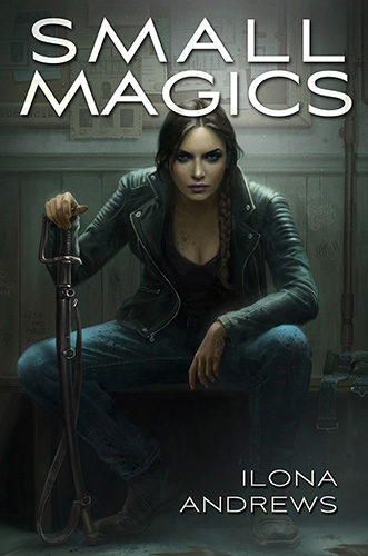
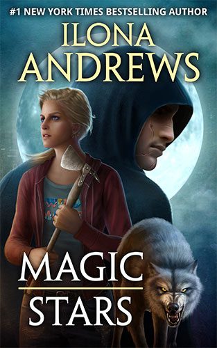
These are gorgeous covers and you can see why the artists would be in high demand.
BRANDING
Take a look at these covers.
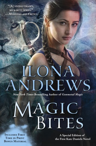
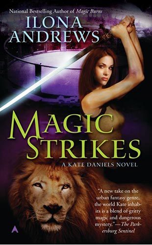

There are 3 common elements to all these covers: a girl, a sword, and a lion. This is branding at work.
When we decided to do the first Kate novella, we just kind of puttered around and then it was finished. We needed the cover quickly, so attempting to commission an artist, especially over the busy holiday season, would’ve been difficult. We needed to make our own, and whatever we made had to be instantly recognizable as a Kate story.
All of these covers have a specific look. They are photomanipulation covers, meaning a photoshoot took place and then the images of the model were heavily processed in photoshop. If these covers had been painted, we would be out of luck.
Fortunately for everyone, while I’m seriously lacking in artistic skill, I’m good at photomanipulation. I had to learn how to do it, because majority of our promotion takes place online. We would ask the publisher for banners and promotional images, and they were never in the budget. We had to make our own.
A side note: when a publisher commissions a book cover, they buy very specific rights, meaning they pay for the right to use the art as a book cover only. If we were to cut the cover into a banner and display it on our website, we would be committing copyright infringement.
Example:
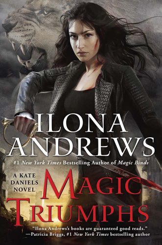
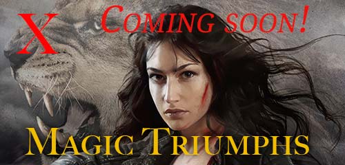
That type of image usage is illegal. We made it a policy to always enter into a separate contract with our cover artist, even if they are commissioned by the publisher, to purchase the rights to display image on our website and in promotional materials. that’s why you see all the beautiful banners.
Since I had to learn how to do the banners, more advanced photomanipulation was the next step. I did a lot of tutorials.


Finally, over the years I developed enough skills to create decent photo manipulation covers.
We knew we wanted a girl, a sword, and a lion. These are the original stock images.
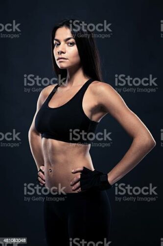

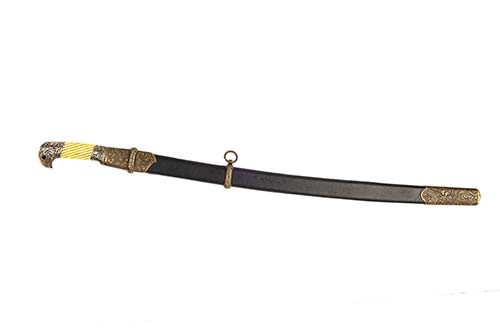

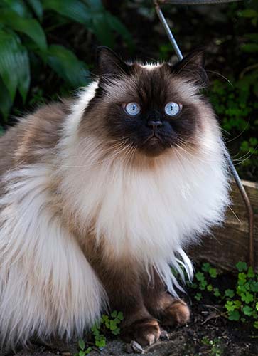
Wait a minute…
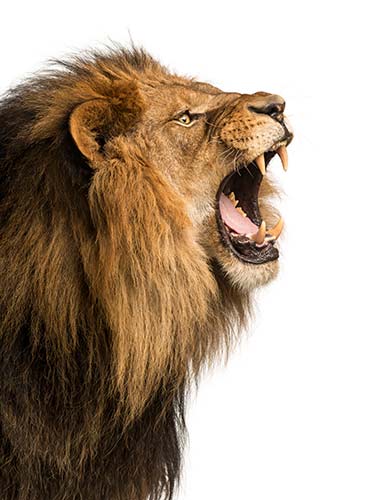
Then it was the matter of putting it all together, tinting it the right way, etc.
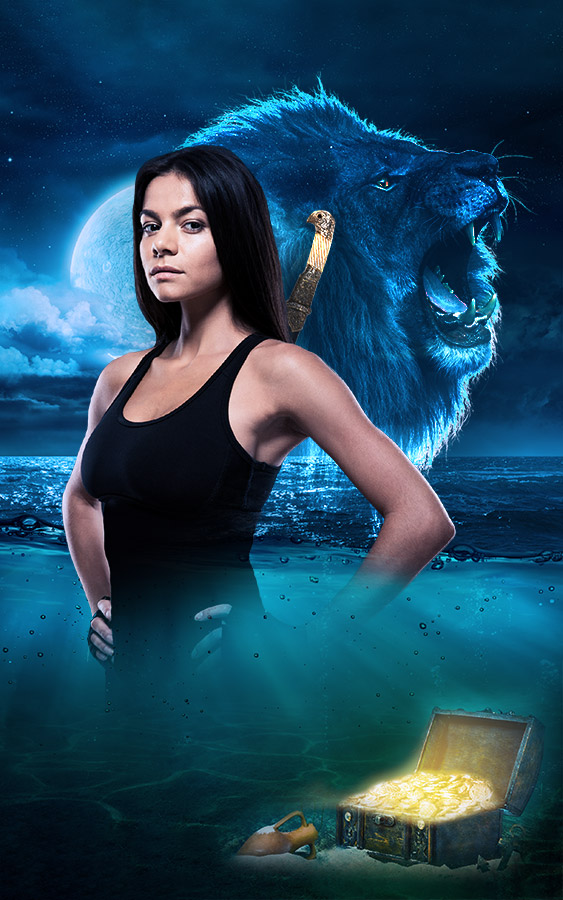
Natanya Wheeler of NYLA, our literary agency, added the typography because I know my limits and I suck at typographical elements.
This cover hits all the branding elements we needed and is instantly recognizable as a Kate cover. And there you have it.
We had a discussion regarding outsourcing the second cover, which Gordon shut down. According to him, the first cover is pretty and on brand and there is no reason to switch, and that’s how Magic Claims happened.
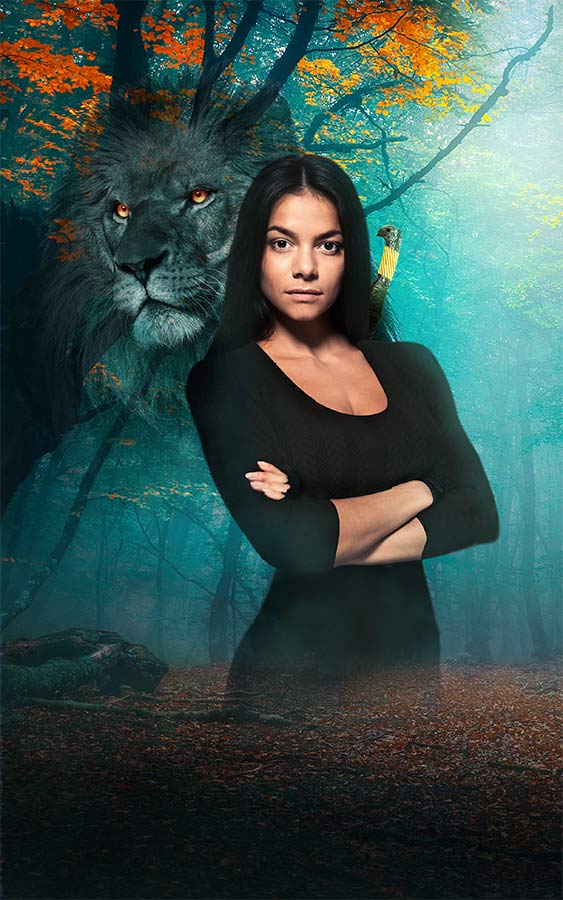
ModR was instrumental in selecting the right background. I sent her about 20 images and she picked that particular forest for its prettiness.
Funny thing about Magic Claims. The model on the cover is wearing a sweater, because it’s fall. However, all of the images we had of her were gym images, where she looked tough but wasn’t appropriately dressed. I was browsing a different stock site looking for someone in a similar pose and found a completely different set of images with her, which I immediately bought. This is what Kate looks like in the office.

And now you know all of my cover secrets. If we do a collected edition, we will likely commission an artist for that cover.


Your work is stellar. IMO. I am a (very) old-fashioned paint artist and I never learned/cared to learn enough to be as good as I needed to be in order to enjoy/ graphic art and photo manipulation.
I spent 20 years using the same 5 watercolor pigments in order to master that craft of making the most out of a limited palette.
Now I still use 5 colors, max, per painting, but have vastly expanded which 5 I choose.
The work of mastering a totally new art form was beyond my desire. But it means I especially appreciate those are teach themselves and excel at it.
It is my life’s ambition to be able to create a watercolor painting I am not embarrassed of. You have my deepest respect.
may I humbly recommend checking out Cinnamon Cooney, the Art Sherpa, who has lots of simple watercolor (and acrylic) tutorials? when you are ready to give painting your next try, she makes it fun, and teams up with her husband, to make my favorite art-teaching team!
I like stock girl as Kate. She matches my mental picture of her. Also, photoshop is simultaneously fabulous and horrible. Lovely work
Thank you ; it’s fun to see how things work in your industry. Both of you are incredibly creative – my creativity is pretty limited – creating a decent excel spreadsheet and making a lovely dinner lol.
Please continue these types of blog discussion!! We love it!!
there’s so much to the process I didn’t think about. Working on some novels now and eventually going to have to figure out the covers. Thanks for the insights.
Kate in a corporate office. The mind reels at just how that might play out.
“Does anyone know why the printer is in, ah, four pieces? Looks like someone hacked at it with a sword.”
::silence::
Thanks for sharing your cover creation process. Always cool to see the behind-the-scenes stuff.
That was my thought! Now I want Kate in an alternate reality as an office drone, or office drone as her cover as a vigilante. 😉
I am so there with this idea.
Yes! We need Kate working undercover in a typical corporate office… Can you imagine her as someone’s P.A?
Also I think Curran should be working at the same corporation, but in Shipping and Receiving…
Shapened letter openers. So many painted black but really sharp and perfectly balanced for throwing letter openers.
Oh the possibilities….
I’m picturing long staples being thrown like shurikens.
I have always seen Kate in my head as a young Claudia Black. Don’t ask me why; only my subconscious knows that answer LOL!
https://m.media-amazon.com/images/M/MV5BNjUwOTU0MDI2MF5BMl5BanBnXkFtZTgwNjY1Nzg4MDI@._V1_.jpg
The covers are always lovely, and I appreciate you all went that extra 10 miles of effort for them <3
Agreed. Young Claudia Black is the BEST!!
I have never seen this model/actress before, but I have to say she would totally kick ass as Kate. No One would mess with her!
Snap! I always pictured her as looking physically very like Claudia Black, but with Eva Green‘s scariness.
I love seeing all the possible Kates though, even if Kate in my head is firmly fixed.
Me TOO!
You nailed it! I have always loved Claudia’s toughness.
Loved her in Farscape????
Body – attitude – face & accent????
its the sass that claudia gives off with her acting, its the same sass kate has.
I choked on my tea (lemon-myrtle green tea). Kate in the office … smiling!!!
Oh, the Working Girl fantasies of office mayhem 😀
Thanks for the laugh and explaining the covers and how they evolve.I have my favourites, but they all impress with their attention to detail.
The Kate from Small Magics is the one I always see in my head. She looks mature and bad a$$, like she has seen some $hit. Curran is one I have troubles picturing. Do you have any images of him that aren’t furry?
Let’s see if this works- I’m attaching artwork by Luisa Preissler
Yep! Thanks.
Yep. That’s one scary dude.
that’s the one from the calendar. I love that one ????
Same here! The Kate on the cover of Small Magics is my fav and how I pictured her.
Yes, Luisa Pressler ‘s artworks for Kate and Curran are the ones for me. I always favor illustrations, artworks over real people. I don’t know why, but I don’t like covers with real people pictures.
I aknowledge the beauty of the last covers nonetheless, she makes a beautiful Kate.
Preissler, sorry I butchered her name.
So does this model get a notification when she gets a purchase? (idk how to describe it, lol)
Or one day at the bookstore, she’s like, ‘Wow! I’m even more badass than I thought!’
Stock images are usually uploaded by the artist/agency, not the model ????, and they do get an accounting of their images being purchased from the stock websites. Not of the use of the image, however.
Thank you, yes that’s what I was wondering, I just didn’t quite know how to describe it. I guess since they don’t tell if it was used/what it’s for after the purchase, she’ll still get a surprise ????
Thanks! That’s what I wondered too, heh
I had a friend in college who had done some modeling work a few years prior. One of her images was bought by a framing company to be the sample pic in a line of picture frames. Yep, the college bookstore happened to carry those frames and there was a shelf full of her. She was very embarrassed!
Thank you!
The image of the woman used in Magic Tides and Magic Claims is EXACTLY how I pictured Kate all these years. I really love the covers for Wilmington Years!
ROFL Here pretty blue eyed Persian kitty! Oh no! Here Big pretty kitty!
Ha, little feline versus the fixed version, cute. Of course now my mind went to Clams ????????♀️ so silly, silly.
Always appreciate the details you give us on the different aspects of the creative process.
Stay healthy and sane @ HA
The very first Kate book illustration will always be my Kate. I find it very interesting how we see someone so differently. Seeing her as a Mom has been enlightening to me. I so admire those who can create these images. I can sew, quilt and cook but not art or music. Each of us has different gifts or abilities that we learn. I am so glad that yours is authoring incredible books.
I feel terribly, but Kate 2.2 will forever be Magic Clams to me.
You’re not alone. I was fine until the post about the typo. Now every time I see the book, my brain sees Magic Clams.
THE CLAMS SHALL RISE!
Thing is — we know HA could write a fantastic book about magic clams.
I don’t really expect a Magic Clams short story-but if I did, for some reason I imagine it would be released April 1st!
That would be fun — I’m hoping we get it as an Easter egg at some point. Just a throwaway line:
“Oh yeah? He still believes in magic clams!”
She had never been the same since the magic clam incident.
“You know why her chowder is so good don’t you?”
“Who knew clams fought that hard?”
????
There are so many layers to being an author. My simplistic version of writing submitting, editing and publishing needs updating. But of course, nothing in life is simple.
However, Kate in an office brings many hilarious adventures to mind. Imagine Kate, at the return desk, HR answering insurance or salary questions, ha ha ha. Definitely no weapons at work…
how does cover and copyright works for your foreign publishers? Your French publisher, for example, has a collector’s edition of KD with art that I believe you commissioned from Luissa Preissler. Did the publisher buy the rights from you, from the artist, or from your American publisher? And if they created a cover art you liked, would you be able to buy the rights and use it?
*deep bow* Your photoshop skills are phenomenal!!
I attempted to learn the way of photoshop, at the office. My boss (an associate dean) learned that I can mutter “four letter words” in several languages.
>_<
It eventually became a game between us. Which language and the exact word. He said "I always provide a smile and new knowledge" when I was either dealing with faculty or photoshop.
Boss: Was that one German?
Me: Yes?
Boss: You just said %uc& in German, didn't you
Me: Can I take the 5th?
We both agreed I did much better dealing with the faculty than photoshop and passed any work needed using that software to the Mar/Comm unit. LOL
I have learned to say Hello and Thank you in the language of every country we have visited… but I clearly need to add 1 more word– I will get so much every day use out of them! 🙂
Magic Bites will always be my Kate. She looked built enough to swing a sword to me. If I had to cast her I always thought of Yancy Butler (Witchblade).
I’m curious. Have there ever been arguments over cover models? As in, the fans had anything to say over the models changing? I feel like that might be something people take too seriously.
The BDH is the best, but passions can run high sometimes hehe. It’s all for love of the books ????, and ultimately the story always triumphs!
The ships can be worse than the cover discussions. ????????????????????♀️
Oh, aye, the Horde sails passionate ships! Which sometimes die under friendly fire ????. Looking at you, Grandma Frida/Adam Pierce.
????
That fire was not friendly. It was a targeted attack by nuclear submarine with advanced weaponry. ????????????????????????
The model for the first few books is the Kate that comes to mind for me as well. I can see the sass in the face XD
No surprise, you are too humble. Your finished product is awesome. I’ve no doubt you twisted yourself in knots to create the perfect cover. I can’t begin to imagine how much work went in to making these covers. I enjoy looking at them! I can’t say that about many of the books I read. I’m including big name established authors in that group. You should add ‘Cover Artist’ to your resume. ????
I always wondered from the descriptions in the books if Kate’s sword was a shashka. I got unreasonably excited with the two Wilmington covers when it was! 😀
Thank you for blog posts like this one. Your generosity in sharing the creative and business processes is deeply appreciated. The great artwork makes visiting your blog fun and uplifting. You and your team work hard, it always shows, and it’s a quality of life booster.
Thanks for this insight into the cover process; always fun to learn about this stuff.
Now I’m waiting for the BDH to start shipping Wilmington Kate’s sword and Roman’s staff.
It’s so cool to read about your processes – thank you for sharing some of the work that goes into the covers.
And I love what you did with your photo manipulation – made for great covers!
I agree with ModR – we may not all see Kate the same way as she’s shown on the covers but it’s what’s inside the covers that matters the most! ????
I LOVE the cover art done by Gene Mollica for Alessandro for Hidden Legacy series. Hubba hubba hubba baby. I’m 71 but still have those inner fantasies.
I’m right here with ya! And I’m 72????
I really 😮 e the cover for Magic Claims. ModR has good taste in Woods.
Any pictures of the lion in the office? 🙂
I totally fell down a Google rabbit hole, but I found wonderful Kate-inspired art. So much talent out there! But apparently Curran is a mysterious figure shrouded in mystery–just that one side-profile. Very sneaky, like cat.
Have you guys thought about doing a special edition of the Kate Daniels series? A la the special editions via the bookish shop, etc.
There is a collector edition of Small Magics, with commissioned art and special binding from Subterranean Press https://subterraneanpress.com/small-magics/
And more pretty editions are coming! ???? Blood Heir and Iron and Magic, and ofc Innkeeper! https://ilona-andrews.com/2023/signings-and-pretty-books/
My favourite Kate is on the North American cover of Magic Shifts. Magic Triumphs is a close 2nd. She just looks so serious and bada$$.
But hands down my fav IA book cover is Blood Heir.
The most realistic statement I ever read about owing a business was about laying the foundation level all nice and neat on the ground and the rest of the levels go on your back. I have this mental image of you as an octopus with each arm holding a different hat with continual swapping as you go through the day. I’m happy to maintain my reader hat and leave the business to you! It’s certainly interesting to read about though and we appreciate you sharing the process.
So cool!!!
I think the covers for Catalina’s series are stunning. Saturated colors, beautiful people, flowing dresses. Buy on sight kind of covers right there thanks to that art department.
But Luisa Pressler and Doris Mantair are art. I bought the Fated Blades and Blood Heir prints and framed them because gorgeous! And the Baylor sisters are framed and resting on a bookcase in my study.
Appreciate the insight into the process!
So interesting! Thanks for the info and your covers are more than just acceptable! They’re quite lovely.
Love seeing your process for covers. I don’t have the skills to design them myself and admire those who do!
On the other hand, I do love putting together the elements needed for covers. For most of my books, I had photo shoots done with a model for the series. I chose the model, hired a photographer, brought in a make-up/hair stylist, and purchased the wardrobe and any extra things needed. One of my covers shows her leaning on a fireplace but she’s actually got her arm on a stepladder, lol. It was the only way to set up that pose so the artist could add in the fireplace later.
We worked out a date where everyone could make it, and I put together an entire instruction sheet for the team weeks in advance so they could prepare accordingly. It included example pics for each pose I found on Pinterest, photos of each outfit to wear, and hair styles to use.
It all sounds expensive but for books 3-7 of my current series I got different poses for each cover and extra shots for promo. To pay everyone and buy all the stuff, plus hold all rights to use the photos how I want, was about $2000. Of course, this took a lot of time and effort to come together, but it was so much fun to do. I loved having 100% control and being able to make my vision come to life. If only I had the ability to actually design covers, though!
Thank you for sharing too. I love your books and appreciate all you do!!
Wonderful and informative post. Depressed just now as I got tough news on a family member , so I was thinking “ what will I do to take my mind off things?” I decided to check out your blog. All of y’all are great in your posts. Thank you for such a great blog, and fabulous book. Lastly the BDH is fantastic as well.
I think your covers are fantastic but I’ve always really loved that Magic Bites cover.
Love the insights! You do have talent in the art department. The novella covers are awesome! Thanks for sharing!
I love the idea that you did some of the covers with photo manipulation. You mentioned tutorials. Are there any that stand out that you could recommend?
So impressed with your photo manipulative skills and how you put togther the cover art. The Kate on the new novellas is exactly how I have visualized kate – amazing how you are able to put together this vibrant cover from stock images.
As one of the other commentors here, I am also an oldfashioned artist – I worked in photoshop when I was younger, doing digital art, but never got really good at it. My 12 year old daughter is so good at using procreate now, I tried to learn as well but she had just zoomed past.
I was re-reading KD series over the christmas and painted a few watercolor paintings inspired by KD.
Whoops – tried to attach images as well.
Hi Elizabeth,
The limit for pictures attachments is 1MB. What sometimes works is taking a screenshot of the picture and uploading that ????
What a wonderful insight! I love the Luisa Pressler covers best, but the Kate model you used for Wilmington really is a great fit.
Cute Himalayan cat!!
Luisa Preissler’s Kate is the bad ass I always wanted to be, but alas, am only me. Sigh.
I have caught glimmers of other authors’ struggle to get their characters depicted correctly. All admiration to Ilona for her art. I can’t think of another example where the author depicts their character in a realistic manner, giving such a clear idea of what the author has in their head when they write the words describing the character.
I love this! Thanks for the behind the scenes. Not that it matters but Magic Triumphs is how I always pictured Kate. Even more so once I learned her background. Very ME and beautiful but still bada**. And then her aunt would take that up a notch to stunning haha. I am amazed by the art magic people can do with the right software and knowledge. That alone is genius and to also have a creative side in addition to the technical side and the mental energy and curiosity to figure it all out- awesome!
Fascinating!!
do you suppose this model knows that she’s the current face of Kate Lenart?
This is definitely not what Kate looks like in the office. The office isn’t burning, I call fake(!)
I would absolutely love to see an interview with a cover model. I assume this woman knows she is on the cover of your books? or is it kinda one of those things where she gets paid thata it, doesn’t matter how many times her image is used.
can you imagine walking into a book store or surfing online grinding your favorite book and realizing that you are in the cover! haha
Stock image sites have millions of generic photos created without a specific project in mind. They are then licensed, usually for a fee, to individuals or organizations for use in marketing materials, websites, packaging, book covers and more. The artists or agencies are the ones usually uploading them ????, not the models themselves.
The purchase also does not contain a notification on how the stock image is used.
Here is an example of a stock image website for illustration ???? https://stock.adobe.com/uk/
So interesting, thank you! So there is totally the chance that one of her friends/family members bought the book and said OMG that’s so and so! Haha!
Also my apologies for all the spelling mistakes, in my first post!
Fascinating. Thank you.
I really like this new Kate! I always wondered why Kate was always a different
person from one cover to another. Maybe you wildly underestimated how popular Kate would become when you wrote her first book.???? Maybe your old crystal ball
should go keep company with Gordon’s cement mixer/coffee grinder.????
Some authors don’t realize that ebook covers are often purchased from a postage stamp sized picture on a phone and they make them either too complex or all look the same at that size.
Fortunately for you, the BDH would read your books if they had a solid color cover with legible titles. The beautiful covers are lovely icing designs on fabulous cakes!
The main Kate Daniels series was traditionally published ???? – authors have little to no say in such covers, it’s all publishing house decision.
I know most people will not agree with this, but I would rather not see Kate’s image on the cover. I have a very specific picture in my mind of what Kate looks like and when I look at the images on the cover, they never match up. I know that’s just me and that’s the way it is but just sayin’… ????
I sort of agree with you there. I pay very little attention to book covers, especially in these days of ebooks, but on occasion a cover has been so jarringly out of place I’ve had to look back at it midway and just wonder what the heck?
I do have a portfolio of Josh Kirby art and several Clarecraft figurines however. . .
And on the flip side some covers used to draw me in to having a look just by being recognisably of a beloved genre/publisher – Baen and Ace were big culprits back in my physical copy days, which is the reason why I’m an Ilona Andrews fan!
Those are some great photomanipulations and thoughtful cover design! That’s really smart to buy the rights for promotional materials. Are you willing to share a sample contract that you would use for that?
Such talent! And I mean you! I would love a t shirt with all of the cover art shared here. That Curran profile! Thank you for educating me on the business of actually putting a cover together. I often choose unfamiliar authors based on the cover. There was this man girl…I had to have that cover. We need murch I think. The photomanip you have been doing is genious. Maybe I can make just myself a shirt without getting sued. Lol. Not really. Anyway thx.
Ilona your cover looks great! Gordon is right, and not gonna lie- I actually prefer it to some of the others that were commisioned professionally ???? I guess you jsut know the brand so well that you can get it bang on even if you’re less comfortable with the art side of it
I had no idea you created the cover. I assumed it was a professional job. I am so impressed. If I was in charge there would quite possibly be stick figures.
Ditto on the stick figures. My kid has to make a CA Mission next year. He is so screwed. It’s a good thing I’m friends with an artsy mom, who will hopefully be able to guide him.
Wouldn’t it be fun to be that stock model and see yourself on these covers?
I am a member in good standing ( If by that we mean I buy every book and novella HA writes.). However, I confess to not paying much attention to the book covers other than “It’s a HA book set in the xyz universe. Yea! I’ll buy it.” The pictures you posted are pretty just not my focus.
*high five*
I confess I’m firmly on team “don’t judge a book by its cover”…literally ????. Especially with certain authors.
Ditto!
Especially since I read primarily on my Kindle so i very rarely care what the cover looks like. Although when someone points out that a position is literally physically impossible or some absurd thing like that I have to laugh!
Thank you ILona. I appreciate the topics and the time you spend with us on the blog. ????
You go Gordon! That cover is pretty!
Not connected to this posting, but I just heard that Austin had a devastating ice storm. The weight of ice was pulling down trees. Are you guys okay? Were your the kids affected?
House Andrews are well ????, thank you for worrying!
I love that you have taught yourself photo manipulation! What were the easiest and/or best tutorials to use?
On another note, I’ve recently become a proud member(ish)of BDH! All of your series are now my comfort reads.. and I enjoy them immensely. Thank you❤️
Yay! Welcome ????. So glad you love the books!
I totally love the regular cat in that mix. Too bad you couldn’t put that cat in as the hidden Easter egg. LOL. Even the idea makes me smile and chuckle.
This is all very interesting information because for me right now I won’t even consider anything but photomanipulation for a cover, even for a novel. I have paid for some covers in the past, but a lot depends on whether it’s first in a series, how a given series is already doing, etc. I’m not sure readers always understand just how many sales it can take to recover that cost. Not that readers should be overly concerned with such, but I have to take it into consideration as a business cost when planning a release. And I’m not complaining about artist prices–but yes, there’s lead time, which means you have to know exactly what you want when you start looking for an artist and that process usually happens for me before I’ve finished the novel. And I’m a panster. So a lot can change! Then there’s illustration versus paying for someone to manipulate the photos and then there is the whole font/type/title (and I need to take some kind of class in that because I am just not good at it.) It’s very interesting to read your thoughts on the process and realize they are not so very different from my own. You do an excellent job at the photo manipulations. I cannot distinguish them from any of the pros. Really nice layouts. Of course, doing your own also makes it easier for you to price your novellas–and I truly appreciate that too!
Thanks for the informational post.
Thanks for the insight on cover creation, cost constraints and how you do it.
I can imagine how much Luisa’s work is in demand. Her art is a thing of beauty.
My Kate looks like Magic Bites or Magic Triumphs covers. I also like Small Magics Kate a lot.
I’ll keep my fingers crossed for a collected edition of Kate’s Wilmington years!
One thing that bothers me about some of the covers for the Kate Daniels books is that the image of Kate Daniels isn’t the same. Another thing is that since her father is Sumerian, I would expect to see some of that regional influence in her appearance, which I do in the covers for Magic Triumphs and Magic Binds–very nice covers. In most of the others, I don’t, which throws me.
the covers, especially for the Wilmington novellas, are all so pretty!
I’ve liked the Luisa Preissler cover pictured here since the day I saw it. It’s intense, striking and focused. The woman pictured there looks to be formidable, and has to be taken seriously.
Most cover art…I’m just not a fan of the genre. I typically hover somewhere between not interested and actively covering my eyes, but occasionally one will captivate me for some reason, like Small Magic’s did.
Fascinating!
Such fun to learn more of the intricacies of publishing. Thanks for sharing.
The small magics cover has been my favorite since ever 🙂
On the early cover Kate looked to me, more like a model than a fighter. I like the way she has toughened up over the years.
I’d be interested to learn more about what tutorials you used, etc!
This is wonderful. Thank you very much.
Hee! Yay! How cool. I got my question answered. Naturally, another one occurred:
Can we get an inside peek on House Andrews’ cover request descriptions to cover artists? I remember how amusing and interesting the blog summary of the Fated Blades cover art description was, and the cover turned out so gorgeously.
But I’m not greedy. Ok, I am since I’m part of the BDH, but I totally understand that I have to join the back of the question queue since I just had a turn.
Thanks for indulging our insatiable curiosity!
It will always be Magic Clams to me! Love Kate and fam! Best series ever. Only other series by another author that comes close would be P. Briggs’ Mercedes Thompson Hauptman series.
Can you expand on specific considerations for the spine and back cover? Clearly not so critical on ebooks but on old style bookshop shelves, perhaps still important?
This is a great strategy summary, thank you very much.
This is fascinating. thank you for sharing
This was a delightful read after a difficult week. Thank you for investing your time into the entertainment and education of the BDH. I love special editions and hardbacks because of the cover art which made this post particularly appealing. And now I know why I rarely put off by the covers of your books, and I bet if I look back I will see those covers were the ones where you did not have control!
This was a very interesting post about covers, something I have always been curious to know how this was done. I’m re-reading the Kate novels now and am on Magic Slays. I have to say this is a distressing cover–not an appealing one at all. Kate’s figure seems to suffer from some of the missteps of mocking up a cover. Will you ever reissue with a different cover? How happy were you with this one? I am an avid reader of your work and appreciate that you are in the world.
Hi Sherri,
The main Kate Daniels series is traditionally published. That means both the covers and republishing decisions are in the hands of the publisher ????
Thank you for explaining the cost /reasoning behind the many different faces of Kate covers. Happy writing… I’m happy reading!
This is awesome! I especially love the Kate and Innkeeper covers they imo are always the best! My husband does photoshop for his rugby club. I have listened to him listening to tutorials lol. They are helpful – photoshop is a beast of a tool. Thank you for sharing.
Soooooo cool to see how the covers are made