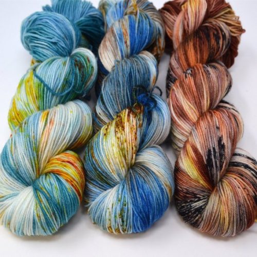
I am still going through the yarn suggestion comments. So much pretty. But wanted to share.
Me, email to Gordon: Do you think this is pretty?
Gordon, email back:
No, it looks like it might have been nice yarn that somebody put in a box in the garage and forgot about it. Years later their descendants opened the box only to discover that age and some foreign substance had ruined it.
Well, I thought it was pretty.
My thoughts run the same. It looks like someone stored in a box with something that rusted when water got in it and the rust drip down all over it soaking the brown one completely and then the brown one dripped on the other once pristine blue ones.
Okay I thought they are pretty but after Gordon’s comment I remember pulling out fabric that had been ruined by motor oil and rainwater that looked like that. If you don’t have that association it’s still pretty in a sunrise/sunset way
I would have said it has a rusting look to it or rusted coloring. But Gordon is word smith. ???
The color changes kind of do look like stains.
I thought, “Poop. And mustard.”
And there seems to be a funky spider sampling the poop on the middle skein.
I can’t unsee the fecal eating arachnid now ? good thing I love spiders. The jumping spiders around here are fuzzy so that fits.
OMG. I saw spider like too in the middle. ?
Was going to say something than the spider comment happened. Now I can’ unseen the spider. ?
LOL, I thought about the same thing about the poo. But more like that either a dog or cat go a hold of the material and ran through the house unraveling it dragging it through all kinds of stuff. Poo, mud, mustard, etc. But Ilona, if you really like it, make it into something, it may look better once completed. Happy knitting.
I love color but Gordon is right. It looks like something rusted and it bleed on the beautiful blue and brown yarn . But I do love the blues they are lovely. Good hunting .
I think it depends on what you are making, but I like the colors, even the rustic yarn.
But it will look different when made into something! Artistic vision is needed 🙂 Just don’t make something for Gordon with that yarn 😉
Gotta side with Gordon on this one. Underlying colors are nice, but those splotches look like mistakes. You’d probably make something, wear it for a while then put it away, then a year or so later go to wear it but then think there’s something on it that you can’t clean off, so you throw it away. Only to come across the rest of the yarn a month later and remember that the splotches were by design.
Or at least, that’s what would happen to me. So, yeah, I wouldn’t get it.
Yeah, I’m going to go with Gordon on this one. The bright colors are not well served by the random injections of yellow, brown, and on the brown yarn – black.
I’m splitting the difference—I think the blue is lovely. When you knit with those skeins, the Fecal Spider (gotta love the BDH’s descriptions), will disappear.
The brown reminds me of someone’s 1970’s loud brown flowered couch, which got shoved in the basement for the kids to play on.
I’m going to both agree and disagree. I can understand Gordon and others comments, can see the imagery. However, I think the color palettes were quite striking. The ‘blobs’ that show currently will look different when knitted. There will be a blending.
Honestly, I think it depends on what this is used for. Needs to be a larger item. I don’t think this works as well for smaller items – which is what you see in the photo. (Not good for mittens and such)
I think the blues are particularly stunning – so rich. Reminded me of a peacock.
The browns would make a rich, dramatic scarf against a solid carmel coat. I’m picturing wool coat, mid-length. Smashing.
Whatever paired with, these need a solid color block as contrast. They will ‘pop’. I say go for it.
Team Gordon on this
Well, I agree with Ilona, as I think they are pretty, rusty or not.
Yeah. What they said.
Sorry Ilona, but I’m another one with Gordon on this – the extra colours do remind me of something I’d rather not have close to my body…. 🙁
Look what I found as one of the best Sci Fi fantasy books iof 2018.
So excited!!
Nice#
Yippee! 😀
I think they are pretty, they would make a lovely color fade if you wanted a larger project. Just because it looks one way in a skein doesn’t mean it will look that way in a project. Sometimes I will look at what people on Ravelry have made out of a certain color just to see how it knits up.
Another one on Gordon’s team, sorry.
But I visited the website of the picture you posted some days ago and now I want a aaaaall the wool! The colors are gorgeous and even have pretty names! ?
I was honestly expecting a poopocalypse story to go along with that photo.
Aww ?. I actually thought the one on the right and one on the left looked really cool and dashing. Totally see them as a huge scarf that looks more like a blanket than anything else haha
I think it’s aesthetically pleasing, in an Edvard Munch type of way. I’d love a jumper or a blanket with all that sort of kaleidoscopic colour play (I know nothing about yarn, it’s probably not a jumper type thread).
I thought it was a picture of yarn with old spaghetti sauce spilled on it ??
Or poop honestly
Gordon sounds like my Hubby. What do they know? Philistines! 🙂
I see a sweater that looks like a fall field or blue water with foliage. I get his view point, but I think it’s going to make some lovely things. I love gradient colors.
I think it is beautiful and unique, and that it would make a beautiful and unique item, such as a sweater. The trick would be to keep the pattern simple to take it vantage of the color variation. A complicated pattern would turn this into a Rorschach nightmare
Or a Jackson Pollock one.
??????
I have quit asking my husband if he likes a particular yarn. I had a kettle dyed dark brown and said “isn’t this pretty?”. He said “it looks like someone wiped their butt with it.”
Fine. I’ll make the sweater for myself.
Except it had a red undertone and I look like my face is made of an old apple in reds… But he doesn’t. When it had a pale yellow thru dark orange pattern on it, he thought it was beautiful… And said” I don’t know why you ask me things like that. We both know you have a better idea of what is going to be pretty than I do. ”
So I don’t ask anymore. I just pick what I like as I have the” pretty” imagination in this family.
By the way, I like the yarn.
so sorry, but I am with Gordon an this one 😉
the first thing that came to mind was that I was wondering how yarn could be rusting 🙂
Pretty.
Those types of handpaints aren’t for everyone, and as mentioned they’ll look totally different knit up.
If they please you, get them.
BTW, your post about knitting gave me a bad case of startitis. I’m looking at All The Patterns. This one came across my fb feed this morning. Looks like an easy knit that I can do some stash busting with. https://www.ravelry.com/patterns/library/inga-10
And I now have an absurd desire to knit this star dishcloth. I don’t even knit dishcloths. https://www.ravelry.com/patterns/library/stars-forever-dishcloth
I love that scarf. Love it!! The pattern at the edge takes it from common to stunning.
I bet the yarn on the far left would knit up gorgeously in this pattern.
Now I have scarf envy ??
I really like the brown one. I think the spots will work into the yarn pattern and create an interesting effect, though I would use a tighter pattern (not lace). I’m not as fond of the blue with brown (but that is my personal preference), though I know it is a very popular color combination currently- quite a few of my pattern books (I crochet) favor blues and browns together. I am drawn to colors when choosing yarn but ultimately its the feel of the yarn that wins me over and those look soft.
Honestly it doesn’t matter what anyone thinks. If you like the yarn then its pretty 🙂
That’s how you know its true love.
Ok. My taste is all in my mouth, but I really liked it. I can think of at least three ways to work the yarn up that would really look great. Loved the range of colors.
**instaling font meant to signify humor/laughing/irony** So, after his comment how long did it take to contact a divorce lawyer? [People please don’t yell at me. I just think it is funny that they can have a conversation like this and last week or so folks were worried about divorce, also, I liked the yarn in the previous post more, I love jewel tones.
Very pretty. Except for the rust, ink, and mustard that’s on it.
Think you can fundvariegated yarns more evenly dyed that would give you greater pleasure
Sorry Ilona, I don’t like it.
Try purple ?
Classic guy comment better than it’s nice dear…leave them to chain saws I say……
I thought it was pretty. But now I’ve read what Gordon said and I can’t unsee it.
I know, right? That and the spider poo did me in. I laughed and laughed.
I love it. Everything looks different knit up. See if you can find something knit up with those colors on Ravelry. I recently bought 2 skeins of stunning yarn to make hubby’s grandmother a shawl and it ended up looking like camo with blue spots knit up.
Pretty, but I always like to look at knit swatches too. You would definitely want to use the yarn with smoothing larger. I do like the blues better, but I like blue. I agree with Juni regarding opinions. If it isn’t for Gordon, then it should be all your call. Happy crafting with whatever you decide.
It’s pretty!!!
And I bet it’s soft. It would make nice socks I think.
I think they’re all lovely!! And would be so much fun to see how the project unfolds as you knit.
Oh my gosh, never trust a man’s answers to a question like that. I don’t even ask my women friends their opinions if I don’t care and it won’t make a difference anyway. If I really, really like something, I don’t want to know if someone else doesn’t like it. It may kill my buzz unnecessarily ;p. Oh, and I think that once you knit something people can really see the beauty.
I think it’s pretty.
I love the blues.
I like them, especially the blue. It won’t look the same once you knit/crochet. If you like it, get it!
Don’t ask Gordon for opinions on yarn. It’s rather obvious he hasn’t a knitters eye to see the potential in yarn. “Freckled” yarn is very much in vogue these days, and yarn in the skein is frequently not the same yarn when knitted up. All the skeins you pictured are beautiful and have the potential to be lovely projects. The challenge is to match the yarn to a project that will do it justice. I’m finding that as I knit more and more, I’m finally able to pair the right yarn with the right project. If you truly love the yarn, then print that picture and keep it in front of you as you browse patterns on Ravelry. I’m confident you’ll find just the right pattern and it’ll all fall into place.
You’re an optimist. It’s nice to read happy thoughts. ??♂️
I think they are beautiful colors and would be gorgeous as a scarf or shawl, or whatever you wanted to make.
He is wrong. It will work up pretty. It’s gorgeous!
It’s a paradox, disgusting and beautiful all at the same time. They’re both right. His description is accurate, but that’s not necessarily an ugly situation.
+1
Wabi Sabi
It’s called “aesthetic of the grotesque”, the symbolists were into it big time. And I completely agree!
I think they are all nice ?
I REALLY liked the brown blend. I thought such colors would work nicely with my coloring.
It is all stinking’ gorgeous! Do listen to the man behind the curtain. He is having visualization issues…..
As someone who crochets I think it’s lovely.
I am always suspect of these types of colorways. Pretty in theory, but in my knitting actuality, probably not so much!
I’m not sure about that one in the middle, but the other two are both gorgeous.
I don’t like the one in the middle. However, when it’s knitted it may be very nice. It just looks like something icky was splattered on it in the skein.
I think the ones on each end are gorgeous and would work up into something spectacular. That brown would make a beautiful, more masculine sweater I think. While that more aqua blue would look fantastic in a longer cardigan. (But that’s just what I would do.)
I am undecided about the one in the middle. The nearly neon blue is a little too bright against the other more muted, earthy tones for my taste. I’m really not sure how it would work up.
I personally think any of the skeins would would knit up beautifully.
Perhaps not a good choice for a hat with earflaps (mainly because of the probable wearer), but a scarf could work.Very artsy colors…
I really should not “opine”, but have always had trouble minding my own business.
Ilona–you do realize that you asked a MALE a question about colours, yes? Never ask a man a question about colours.
And the yarn is beautiful. Is it a hand dyed?
Gordon has better taste in clothes than I do. 🙂 Men are very good with colors. They are just taught they shouldn’t be.
pedant warning
The incidence of color blindness is a lot higher among men, and this includes a lot of the marginal color blindness that manifest as something like reduced color acuity. I think this is another piece of where men have been so stereotyped.* There is definitely a hypothesis floating around that there’s a sizable portion of the male population that has fairly poor color acuity in some range, though perhaps not enough to count as color blindness per se.** Despite some very entertaining more or less ( https://blog.xkcd.com/2010/05/03/color-survey-results/ ) formal attempts at exploring the issue, I haven’t seen one that really nails down the prevalence in any way I’d consider reliable.
…and personally, I look hard scientific claims that reinforce common stereotypes, so I’m going to assume while there are more color blind men overall, most men have perfectly fine color acuity.
* For instance, minor red-green color blindness can result in someone who isn’t fully color blind in those ranges, but really can’t tell that the super pale blue shirt and that particular pair of khaki pants really should never be worn together, oh, dear gods. <= I am describing multiple former coworkers, and the causality isn't speculation. It's more than 10% of the population in some parts of the sciences in the more severe ranges, and you learn to plan your figures around it.
** Note I only address the male population. This wouldn't explain, for instance, my mother.
Thank you. It’s a combination of stereotyping and how we raise our children. Boys are discouraged in areas of interest where color matters. Luckily plenty of them care and choose to learn anyway.
My ex-husband walked out the door many a time to events where a suit was expected, having combined pieces that were not mix & match….Grr-Animals for adults, anyone? Gray pants, blue jacket, burgundy striped shirt and a green-based paisley tie. Not color blind, just blithely unaware…..
There were a lot of Grr-Animals joke with one of my coworkers who was more than a little red-green colorblind. But he wasn’t at all unaware, and he cared about presenting a professional appearance, so he got his partners to check over his wardrobe for what went and what didn’t when he was in a relationship, and asked friends to step in when he was single.
(Yes, he cared about presenting a professional appearance, overall, but we weren’t really a professional team? This was the team that taught me about body slamming tequilla, and combining beer and jetskis… However, we all did a lot of cross team work.)
My mother, OTOH, was ridiculously, infamously bad with color. Not color blind. Not indifferent. Just… wrong. She chose to repaint the family house a color widely dubbed “puke-pumpkin”. Her interior choices were… Well, things like pale blue tile paired with paint slightly more red than fire-cone orange. It was rather nice during my software days when between her younger sister and I (mostly me) we pretty much took over dressing her 🙂 (And I suffer another moment of “Heavens, was I once that person?”)
My ex was NOT blithely unaware. But he hated to be told that the colors he picked didn’t go together. So he’d wear orange and crimson, or crimson and maroon, or kelly green and olive green. After being told my opinion was useless because he was the “design expert” I let him wear his outlandish combinations w/o comment. Now, he’s the ex- and I don’t have to cringe (or giggle) as he goes out the door.
That xkcd piece was hilarious- as always really! I need to start reading them again. I will now forever answer 1.Penis
2.Gay
3.WTF
4.Dunno
5.Baige
to survey questions ???
I am at least two months behind on most of my comics. (I have a feed I used to read every morning. I’ve been reading the ones that get delivered other ways.)
Me: If I’m skipping my morning meeting, maybe I will hide at home and spending several hours getting caught up.
Also me: …but I still have so many things to do! If I feel decent tomorrow, shouldn’t I organized my minions to do some serious video analysis? ??♀️
A friend works as a visual manager for large ‘fast fashion’ multi-national chain. They have a colour flow chart they are supposed to use when merchandising an array of colours; a table of sweaters in 5 different colours for example. Corporate standards has navy blue beside black but staff spent so much time answering the question “is this black or navy?” that their store now places the navy away from the black.
I have trouble distinguishing dark navy from black, so I place them in different sections of drawer, and only identify them in daylight.
As a ‘winter’ I’m drawn to middle skein for myself, but see each for a different coloring.
Ilona and Gordon, thank you for many hours of reading pleasure and hosting a safe and civil world-wide community. May your 2019 be more relaxed and disaster free, and filled with professional triumphs.
Am I the only one who originally read “RGB” as “RBG”?
And the other way around. So many times.
This is why I love this blog. Erudite discussions resulting from simple, every day human interaction.
Personally, I think that especially the brown will knit up beautifully.
Humpf, men.
I can see why he would say that. It’s pretty but has “rusty” looking spots. A guy would got right to garage/dirt.
I think Gordon pretty much nailed it. It isn’t something that I would use.
Female here and I agree with Gordon. My first reaction to that yarn was: Oh, no did their yarn get damaged during all their home improvement issues? Flooded with some nails next to it that turned rusty? I like the blue to white shading but the speckles make the yarn look diseased. The speckles on the brown don’t make the yarn look diseased but I don’t particularly like brown.
+1
+1
Curious do you knit or do yarn crafts?
These are not my favorites but I would not be upset or for a lack of ideas to knit with these. With hand dyed skiens it’s the whole picture rather than it’s parts. I’d love to see them both knit up. Hand dyed yarns are an art form and like all forms of art some love some thing while other hate the same thing and others are not floored either way.
Beauty is definitely in the eye of the beholder.
Sorry, I’m with Gordon too – it looks peed upon
I kind of see what he means on the middle one. It does look a little like it’s rusted…
I like the brown, maybe the middle blue ( I’m reserving judgement), the first blue looks a little like it came out on the wrong side of a fight between a stomach and a popcorn flavored jelly bean.
I say they are ALL awesome! And no, I am not the voice of reason.
That is such a guy comment! I bought a very pretty navy sweater jacket with orange collar & cuffs. My husband said it was a pity Halloween was past. Luckily he saw the look on my face and shut up, which was really good as he didn’t follow up with how much did it cost! He has good color sense, but women’s clothes escape him. I love the yarn. It makes me wish I knitted!
I’m not going to lie, I thought it looked ugly. But don’t let it stop you from buying it.
+10
As someone who spent part of a long, rainy summer fighting mold in places mold had never turned up before, and keeping in mind I don’t do yarn craft, I have to agree with Gordon. Some of this looks like what I was trying to banish with hot water and bleach.
I’d have to agree with Gorden on this one~
Sorry I agree with Gordon. Shrug. But really it’s what you think that matters
I am not fond of variegated yarn that has white in it. I found out a long time ago that when white shows up it means the manufacturer doesn’t want to spend the money in dyeing unless white is suppose to be in the color scheme.
Sorry Ilona, I have to go with Gordon and the others who say about the spider poo (I’m laughing at that). Not very fond of those colors.
By the way, I can see “spider poo” in a Grandma Frida statement when talking about any yarn project. 😉
They are coloured like agates or geodes!
In Australia we often have gold in ours 🙂
I think all three are pretty and would knit up well. There are probably other pretty yarns that Gordon will like better. And you have the fun of more yarn shopping!
I’m going to have to agree with Gordon on this one. I crochet but don’t like browns.
In these cases, sometimes a little *less* honesty is appreciated much more! I think it’s gorgeous
You’re both right. On the one hand, if I look at the yarn as a fiber artist, I think it’s beautiful and full of possibilities.
If I look at it from a practical, non-creative standpoint, it does kind of look like something rusty or corrosive has been dripping on it.
It’s all about perspective. I taught my first quilting-for-beginners class and had three students show up with brown/khaki colors and one who had found this hideous shade of red (IMO) to use. I was so disappointed and had to remind myself: Different people like different things, and this isn’t about my creative process, it’s about theirs. I believe in experimenting with color and contrast… so my example quilt was done in cream, deep purple/eggplant, and a touch of nearly-chartreuse yellow. I was very happy with how mine turned out, but not everyone was a fan.
I think every yarn has a project that suits it. I can see this color palette in a fade project that blends each yarn just enough to do the individual yarn justice and the blend to show how they complement each other. The left makes me think of water the middle of sky and the right of earth. I wonder if you could add a third and do a shawl like https://www.ravelry.com/patterns/library/your-slip-is-showing or maybe https://www.ravelry.com/patterns/library/fading-point which is super popular.
Seriously, you asked a man (even someone as cool as Gordon) if something inanimate was pretty?
This type of yarn can work up with lively splashes of color. I used similar yarn when I knit the Kitty Invisibility Cloak shawl/wrap off Ravelry.
It’s interesting, but I kind of agree with Gordon. It looks kind of mouldy. Lol.
I have to agree with Gordon. I am not a fan of the sprinkle/splash/slap-dash method of dyeing. I much prefer long gradual color transitions. But to each their own…
I have to side with Gordon on this one. The base colors are very pretty, but it looks like something was spilled on them that should be washed off.
I’m with Gordon on this, if anything it looks like bleach leaked in the box and the cardboard melted on top. It was nice until a point.
I like the one on the right but I gotta agree with Gordon’s assessment on the other two. The one on the left looks like it has been mustard stained and the one in the middle looks like it has rust stains.
I like them all. My hubs would probably say the same as Gordon. They would knit up or weave beautifully.
Personally, I think it’s pretty. But now you know not to knit him a sweater from that!
xoxo – A.
Haha, honestly similar thoughts came into my mind. Oh, it looks like the beautiful yarn had contact with some substance that probably also smells not good ? Gordon’s reply was so funny, I really like the way you talk to each other! ?
The reddish- brown is my favorite it’s as if it has nature highlights.
I’ve just come back from Seattle after spending Thanksgiving with the family, half my luggage was yarn ?. Over here in Scotland we have ‘Wool Shops’, with common or garden wool, BORING! So it was a complete revelation to find that even the smallest towns have a yarn shop with wonderful selections of heavenly yarns!. I bought a blue mix worsted from Malabrigo, a beautiful chunky baby merino called Watermelon from Soul Wool (www.knitsalldone.com), a Lush Merino from Ella Rae and a few others! I’m knitting infinity scarves which I’ll accessorise with fused glass buttons or brooches that I’ll make to match the colour of the yarn.
I love the Malabrigo yarn, and have to disagree with Gordon, I was so spoilt for choice…
My husband has great fashion sense…. except when it comes to shoes ? he doesn’t get women’s shoes at all and thinks they need to match 100%… no black shoes with brown dresses kind of matching…
He can tell what looks nice but doesn’t really understand what colors will look good together.
whenever i see those kinds of weirdness in a store, i always wonder who in the world buys those things. now i know 😀
Spaghetti sauce, rust, and black mold.
That’s not to say that they mightn’t make something beautiful, or that the colors aren’t interesting, but I can see where Gordon’s coming from.
+1
It’s a really nice fade combination. It will work as a graduated stripes, starting at one end and working towards the other, working solid skein A, striped skein A and skein B, solid skein B, striped skein B and skein C and then solid skein C.
I love me some speckled yarns!
Was in my local yarn shop last night. They have that yarn in there. I recommended your blog to them.
8~)
In agree with Gordon. All look like they have rust stains on them.
I personally like the way the colors flow across the skeins. The combinations are visually compelling and keep the eyes moving to follow the dappled patterns and the grain of the yarn. I’m sure it will morph into a completely different aesthetic once it is part of a completed knitting project. I’m very curious and would like to see the finished product.
It is AbstractCat yarn, no? She makes fantastic yarn! I love her lace Superwash merino, It looks even better live. Looks fantastic in a shawl 🙂
I feel things can be beautiful without necessarily being pretty. Maybe it is just semantic word play. Something wild and raw can be beautiful because it is full of soul or the truth, but such a thing may not be considered pretty.
The yarns? I like them, they are different.
O dear please dont ask Gordon again. I saw the shot and thought nice. Then I read the comment and I can’t see anything but the once pretty golden brown as a rusty stain now.
Waaaahahaha
I both knit and crochet and i think that that yarn is pretty. However, AHAHAHAHAHAHAHHAHAHA! Gordon is so right!! And now, I’m left going, ewwwwwwwww! I find what pretty???
I always have trouble visualizing what variegated yarn will look like worked up. I need to do a square before I can decide if it will work or not. Either that or see someone else’s finished product before flagrantly stealing their ideas.
My friend just finished an infinity shawl with a variegated blue similar to the middle yarn but didn’t have enough to finish it. She solved the problem by using a sand coloured yarn mixing with the blue to simulate the waves on a beach. It was beautiful. Truly stunning and not something I would have ever thought to do.
Sometimes you just need to work it to see where inspiration will strike.
I think they’re pretty to.
I mean …..pretty too!!!
Where’s the grammar police when you need them.
I like your yarn selections too… you could always alternate/accent with some coordinating solids to tone them down (if they end up being too “busy”).
Patterns I like & some of my favorite yarns/Indie dyers…
YARN:
Gradients – I absolutely LOVE Wendy’s Wonders & want almost every single thing she dyes. I own a few & can’t wait to use them ASAP. She makes them in various longer lengths PERFECT for shawls/wraps.
(http://www.etsy.com/shop/WendysWonders127 & http://www.facebook.com/WendysWonders127)
Honey Girl Farms has a glorious selection & many themed colorways. Shannah has quite a few luxurious bases (Baby Alpaca with Mulberry Silk & Cashmere! Ultrafine BFL! SO SOFT!). She also has solids that complement her variegated/speckled colorways. I own more than a couple & always have more on my “to buy” list. (http://www.sheepandhoney.com/yarn/ & http://www.facebook.com/HoneyGirlFarms/)
Dragonfly Fibers is yet another favorite & I’m currently working on a very basic hat for myself with their SWM & Cashmere blend in sock weight. The color pooling is turning out really beautifully & although the colors aren’t as different as what you posted above, I think that skeins like that are fun… with the right pattern of course.
(http://www.dragonflyfibers.com/shop/yarn/ & http://www.facebook.com/DragonflyFibers)
PATTERNS:
I have found a ton of different patterns on Ravelry for gradients, verigated, & speckled yarns. The Reyna (https://www.ravelry.com/patterns/library/reyna), Close to You, Easy Does It, Hitchhiker, & Linus do pretty well with the verigated & speckled.
For a gradient, The Queens Spiral Cowl, The Junctions Shawl, Patterns by Annah Burns, JaninaKallio/woolenberry.com, & Kate Whiting – all should have options.
My Projects/Experience:
I really want to start the Hotel of Bees Shawl, but I need to finish one of my other projects first.
I’ve crocheted since I was very young (& I’m reasonably quick if I actually work on things), but I just started to knit (continental) about 2.5 years ago (& I’m not very fast).
I haven’t been working on my projects much this past year or so, due to a move, a giant unexpected house project, & a new job.
I hope that you are able to find some new inspiration & wonderful yarns for this upcoming year!