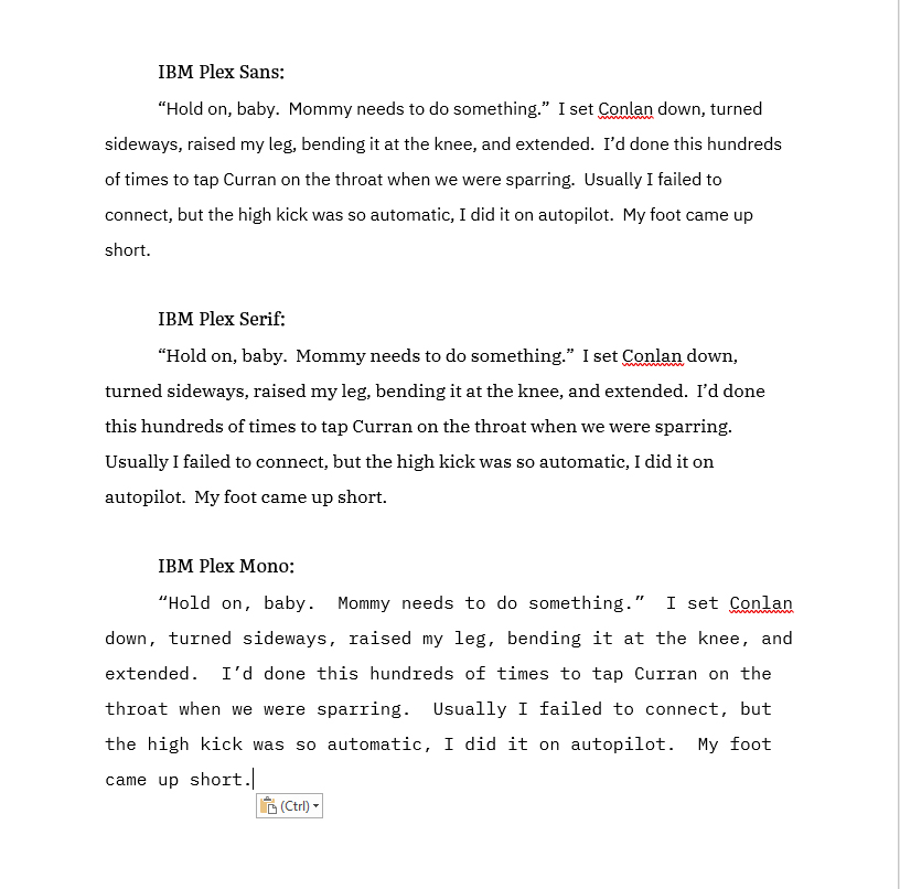
IBM, which used Helvetica forever and ever, has switched to a new font called IBM Plex. There is a fun article about it here. And the best thing, it’s open source and you can download it.
Check this out.
This is a jpeg, so there is some loss of quality. To see a png file, which is huge and might take longer to load, click here.
There are fifty million styles for each, medium, thin italics, etc. You name it, they made it. I think serif has possibilities. Opinions?
Click here to download IBM Plex.


I’m surprised no one made reference to the SNL Ryan Gosling Papyrus skit. You should check it out if you haven’t seen it; it’s a hoot.
Alright, I had to check out the skit. That was funny. Who thought of that to make something of it??? Was original.
Well, just viewing the examples above, I like the Sans font best. I’ve always preferred a cleaner edge to the letters.
I find the serif easier on the eye to read.
Yes it is. I find it sustantial without taking up to much room. It is bold and solid yey compact. It gives the sense of a fountain pen, thin & thick without the tapering.
I don’t know why but for my eyes … I liked the serif.
Of course, then I wanted to read more about the kick.
IBM Plex Sans or Serif please.
Serif would definitely be my first choice, then Sans. Just couldn’t imagine trying to read an entire book in Mono!! YIKES!!!!
Loved how you also managed to slip us a little snippet in there too!! Not only are you a talented writer, but you are also pretty good at keeping the BDH poised and drooling in anticipation of the release of Kate 10!!! Thank you for the snippet! I love each any every bit I can get!!!!!
Mono has it’s uses! …specifically, if you’re doing something like code snippets, where uneven spacing is going to make everything a lot less readable.
I’m going to have to download these and play with them. I have deep and possibly unnatural love for Linux Biolinum, and use it wherever I possibly can. I use the complementary Linux Liberation family of fonts – which are really well constructed (and also open source) – when I need things a little more, er, normal, but I don’t have the same passionate attachment to them.
Yes, I like it the best. Easy to read and seems cleaner.
Doesn’t matter, if the cover says Ilona Andrews, I will read it; however, either Serif or Sans is ok with me.
IBM is still around?
Lol
Oh! Nice! I definitely like the serif best. More inviting!
Yes, Serif is my preferred version.
I like Serif too. It seems easier on the eyes and clearer.
Serif
Serif please!
Now I need to know who Kate was trying to kick? Pretty please?
Love, love, love to hear about Conlan….but what did Kate’s foot fall short of?
And i like Sans best..
Ya, it’s the font we’re paying attention to. Lol, You are a big tease!
I love your brain. If Serif is your happy font, rock away Authorlord.
Serif is easier to read and attractive.
I liked serif best
I prefer sans myself..I am curious though, does it makes a difference to your output if you use different writing during the process?
* fonts
It depends on the medium. I think the Serif would be cleaner and easier to read in hard printed style on paper, but the Sans would work better in the long run for reading on screen – easier on the eyes for long periods of time in a chunk. I’ve noticed on my e-reader that I can run the battery down using a Sans Serif font, but I have to rest my eyes more often and take a break from it with a Serif font. Not an issue with paper pages.