
It is Monday, and I’m armed with Russian Country tea and a list of BDH questions.
The process of creating the Maggie cover through traditional publishing. How did everyone decide on the theme, covers, etc? Were there other drafts or ideas? Why is the UK cover slightly different in color?
We have now worked with several traditional publishers, so we are a little jaded about this process. Usually it goes like this:
Us: Here is the manuscript for a hypothetical book titled The Rose Dagger.
Editor: Sales hates the title. Can we change the title to Daggers and Roses?
Us: Yes.
Editor: What do you want on the cover?
Us: A green dagger with a white rose.
Editor: Here is a blue sword with a green snake around it.
Us: …
Editor: I will see what I can do.
One month later.
Editor: They made the sword two inches shorter, and turned the snake white. Marketing loves it, and we’re going to print.
Here is how it went with Tor:
Editor: Do you have anything you’d like me to keep in mind? Wish list items, recent covers you’ve loved, recent covers you haven’t loved, any aesthetic boards/Pinterest boards/etc? Anything you want us to know?
Us: We don’t want an item cover. We like this and we don’t like that.
Long and detailed conversation regarding the cover and the title, including who we are appealing to, what kind of cover style would be best, which colors are our favorite.
Editor: Behold a list of artists. Which artist do you like?
Us: We like Andrew Davis. (Although honestly everyone on that list was amazing.)
Editor: Andrew Davis it is.
A few weeks later.
Editor: Here is a sketch!
Us: Love!
A few weeks later.
Editor: Here is the color version.
Us: Love even more!
So it was a shockingly awesome experience. I have summarized it but there were many emails going back and forth. Hopefully, Tor is cool with us drawing the curtain back a little bit to show you how the design of the cover was chosen, because a lot of thought was put into this image and I want to give them credit.
The Cover Process
The primary function of the cover is twofold: it must be eye-catching and it must indicate the genre of the book.
The challenge here was to communicate several things. This Kingdom Will Not Kill Me is an epic fantasy, so we wanted fantasy elements. This Kingdom is also a portal fantasy, so we wanted something to point to that.
Type of cover.
We didn’t want an object cover. This would be an object cover, for example.
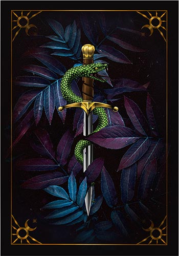
They are very beautiful, but there is an awful lot of them. If you search romantasy and object cover, you will find a plethora of books. Many of them have similar elements: sword, crown, flowers, etc. It’s a little harder to stand out.
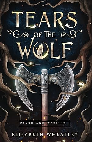
Here is an excellent example of an object cover from Elisabeth Wheatley. By the way, the second book, Oath of the Wolf, is out.
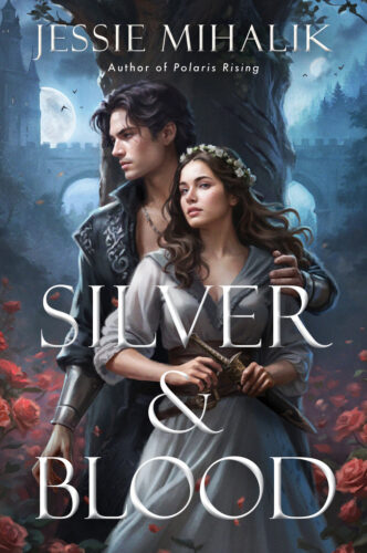
We didn’t want a cover with people on it. The issue here is twofold again: if we put a couple on the cover, that would be a spoiler and it would also not match the book, because a couple communicates romance like Silver and Blood.
We didn’t want to put Maggie on the cover either.
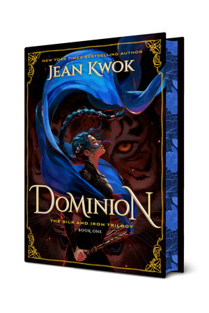
This beautiful Dominion cover reads romantic fantasy and has slight YA/NA overtones, which is exactly what this book is – it is a romantasy with a young protagonist.
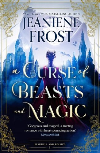
The Curse of Beasts and Magic cover communicates the portal nature and has a person, but also has paranormal romance/urban fantasy overtones, which are perfect for this story, since part of it takes place in our world. It is also clearly romance-centered.
None of this would work, because Maggie is never shown in our world and while This Kingdom has a strong romantic arc, it is more like Kate Daniels in a sense that the love story is there but not central.
So: epic fantasy, portal transition, no objects or people on the cover to appeal to a wide audience that likes fantasy.
Art Style.
The next question was art style.
We didn’t want realism.
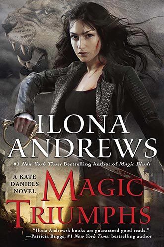
This is an actual person with the art backdrop. Didn’t want that. This Kingdom is about a person falling into their favorite book. We wanted to get the “magic book” overtone across.
We didn’t want graphic style either.
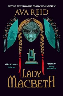
This is very clean and geometric, but we wanted intricate and fantastical.
Colors.
This was very straightforward. Tor asked us what colors we liked and we said blue. We also expressed a preference for a lighter color palette. Again, this is to make sure the cover stands out. A lot of the romantasy right now follows a similar color scheme: dark background, saturated red or blue, and some kind metallic. It’s almost gothic-looking.
Cover elements.
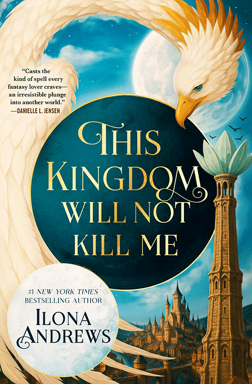
The beast: one of the most prominent elements on this cover is a magical beast. While it doesn’t look exactly like that in the novel – the artist interpreted the description – the colors and the general shape are correct. This is a creature that is massive. It looks prehistoric, a mammal with a beak, and it can travel over great distances. It symbolizes travel, transition, and change. And it nods to the dragon in The Neverending Story.
The three circles: these symbolize the moons of Rellas.
The ocean spread before our boat, endless and calm. The clouds melted away, and an enormous sky reigned above, studded with glittering stars. Three moons spilled their light on the water: Prata, a giant silver crescent with gold tiger stripes; Drao, a much smaller ruby-red waning gibbous; and Broe, the smallest of the three, a grass-green, last-quarter moon. The view took my breath away. I smelled the briny salt water, I felt the wind and the steady movement of the boat under my feet, so it had to be real and actually happening. But it was so . . . magical.
The city: this is Kair Torren, the capital of the Kingdom of Rellas, where Maggie lands. This city is a huge part of the book. I’ve read a very kind review once that said that we tend to present cities as characters, and that is probably true. If Kair Torren was a person, it would be an old, experienced assassin who masquerades as a courtier by day and then ruthlessly murders his targets by night.
Kair Torren means castle towers. The city began as a castle looming on a hill and guarding a port. It could be seen from far away, and when people gave directions, they often said, “Go until you see kair torren.”
A little bit of nerding out: the word itself happened to be generated when we created the Rellasian language, and we loved it. There are many similar sounding words in several languages and they all somehow apply. We have Welsh “caer” meaning fortress, and the Norse “Kair” meaning rock or cliff; Hawaii “kai” meaning sea. Kair Torren is a heavily fortified city, situated in the hills overlooking the sea. This word pops up frequently in different fantasy books and games, usually meaning castle, and that also works because in our world, this city was in a book.
Okay, I will stop boring you with research now.
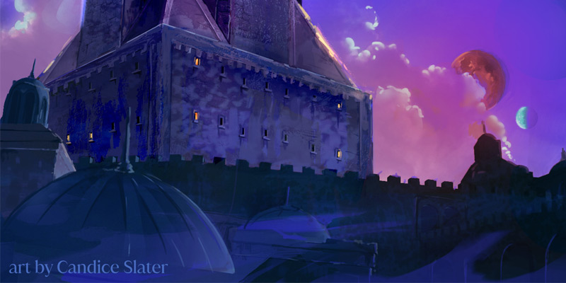
The Mage Tower: this is the first thing Maggie sees when she comes to, and it is a huge shock to the system. Not only does she recognize it, but it is also very clearly magic. There is nothing like that in our world. I have beautiful art of this tower from Candice Slater, which I will show you a little closer to the release.
You can see why we love the cover. It is packed with all of the things we wanted.
Foreign Editions
To date, This Kingdom has been sold to publishers in France, Germany, Poland, Slovakia, Spain, Ukraine, and UK. Sometimes the foreign publisher retains the cover with slight alterations, and sometimes they commission an entirely new cover. This is driven by market considerations. They know what their audience likes and they try to appeal to them.
The UK edition uses the existing US cover with slight alterations.
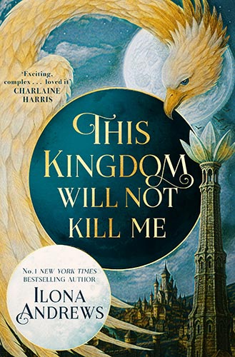
The publisher felt that the UK market appreciates a more gritty sensibility so they darkened the edges and applied some texture.
I will post more foreign covers as they come along. What are some of your favorite covers?

Whee! First?
First in the Tower 😀
First time being anywhere near first, woot!
The Book Thief (http://4.bp.blogspot.com/-WemmcdBXQeo/UrFpoDxKqdI/AAAAAAAAFBY/eqirWUbrpq0/s1600/the+book+thief.jpg) has a whimsical dancing skeleton and the perfect font.
The cover of The Patron Saint of Ugly (https://m.media-amazon.com/images/I/51kTlapaiAL._SY291_BO1,204,203,200_QL40_ML2_.jpg) is so perplexing and quirky that I had to pick it up.
Yeha, am I 2nd? Thanks
I love, love, love the Luisa Pressler cover for Silver and Blood, but agree it wouldn’t work for the fantasy. The light blue, gold, and white makes your cover pop amidst all the dark covers out today.
O.M.Bob. So close!
Love the cover! I can’t wait for the book!
New IA content!!
Only 4 before me! So good to see you doing things on the blog, good health to your eyes!
Thank you for explaining the types of covers. I might have guessed some correctly but certainly not many.
The cover and colours are beautiful for This Kingdom Will Not Kill me. Prefer the non UK version.
The cover is beautiful. I prefer the US version with the lighter colors.
Hope your recovery is proceeding smoothly. My cataracts were done a couple of years ago and I’m still astonished by the change in color perception.
Really interesting to read the thought process. I like both covers, but even though I’m from the UK I prefer the US version.
Such an interesting read! I’m from the UK and prefer the US version though 👀😅
Though the UK version is giving me Van Gough vibes
Me too, although I normally prefer UK over US versions. I suppose that shows the publishers really do know their audiences.
The different covers for different countries for This Kingdom Will Not Kill Me reminds me of Nalini Singh’s covers for the U.S. readers and international readers. I though the covers would be the same for all readers. Then I saw the two different covers. It is interesting to read why there are different covers for different countries.
I liked the original cover of James Clavell’s “Shogun” with just the samurai sword. Now, the cover shows an outline of a samurai. It’s ok, but not as dramatic as the original cover. The original cover was the one that caught my eye and got me to read the entire book when I was in my early teens.
I like all the Kate, Innkeeper, and Hidden Legacy covers. They show some of what is in the book, but not all of it.
I saw an international cover (not UK or US) for iirc Nalini Singh that used a cover from Seanan McGuire’s book. Makes me wonder how often foreign publishers just go ah, same genre smack pretty fantasy-ish cover on!
Thank you so much. I am so looking forward to Maggie’s story. Love the ideas behind it. It’s like another sneak into the new world.
I look forward to these posts more than you know! Thank you!
I’m just so happy that this trad publishing experience has been positive and different!!!
And that work on Book 2 has also been productive and fun.
A happy author is a successful author.
best wishes for continued success.
I’m so glad that Tor listened to you guys!
As an amateur author with hopes of joining the publishing fray one day, these kinds of posts are so helpful because they allow me to understand the language and process and, when the time eventually comes, communicate my wants and needs as succinctly and accurately as possible. Thank you! Knowing what to expect (on average) and how things work (in general) is both fascinating from a wheee process view and a meeeee process view lol. Happy Monday, HA and the BDH. Can’t wait to dive into Maggie’s world next year.
Genevieve, if you go the trad route, when you reach a contract stage, it might help to indicate to your agent to fight for cover approval, if you can get it. Cover approval allows you to veto the cover. Cover consult just means they will ask you what you would like to see on it.
Thank you so much! That’s very helpful info to have on hand; I will add it to my collection of notes under the “things to ask an agent…” subheading. 🙂 I appreciate you as always for making things fun, light, and informative.
Wants: green dagger with white rose (literally in the title of the book)
Gets: blue sword with green snake (neither of which is in the title)
I am neither author nor artist, but if the title of the hypothetical book has “dagger” and “roses”, as a reader I am expecting those to be on the cover. A “sword” and a “snake” ain’t cutting it.
Cheers to Tor for a beautiful cover for our beloved Maggie’s most excellent and greatly anticipated adventure!!
Some of my favourite covers of all time are Beguilement and Legacy by Lois McMaster Bujold. Beguilement has the female protagonist, and Legacy has the male protagonist. When you put the two books next to each other, the pictures combine to show a really romantic (not sexy, just romantic) moment from the first book.
I really like the Maggie covers too. I’m in Australia, so now I have to decide whether to get the US or UK version. I was leaning towards UK, for the spelling, but I prefer the US colours. Decisions, decisions…
ditto LOL
Also in Oz and I just exactly the same mental debate. I am currently leaning towards the US edition because I prefer the light colours. But it could change…
If you happen to have the (financial) space for it, and the US and UK hardcover with dust jackets happen to be the same size (including the spine!), you could, theoretically, possibly, buy both editions, swap the jackets, and end up with the UK book inside the US dust jacket. Mind you, I haven’t checked the specs and until the spine is finalised you won’t know if this is an option at all, and again, it’s not the cheapest option – although I suppose you could gift the US book with UK cover to someone you’re trying to lure into the Horde 😉
Just a thought and not in any way a for sure thing!
I really enjoy these peeks behind the curtain. It’s so interesting to learn about the various aspects of writing and publishing.
I hope your cataract surgery was completely successful so you can look at the covers of you own books and be amazed at the colors and details!
Really like the new cover! Anxiously awaiting the new book.
Fated Blades cover has always appealed to me. It is rather intense and love the motion.
The Fated Blades cover brought me into the Kinsmen world. Before that I hadn’t checked it out
I love that cover too.
On the bit about languages, it made me think it works in Portuguese BR too: “Cair” is the verb for to fall, “Torre” means tower; it really brings to mind some sort of distant cousin in the Latin languages branch where the sentence structure is inverted to verb-object/subject, giving this idea of a massive tower that maybe has a reputation of people falling lol.
Super cool, love the insight!
May I say that the cover looks like it is a book that will be a fun read. So many books have covers that are very dark and gloomy. The book may not be but the cover is.
Maggie looks like the kind of book that you would pick up after you come home from work and have popped dinner in the oven while you wait for the rest of the clan to come home and need you to tend to them in this world.
But, for the next ten to twenty minutes, you can fly away to a magical land and have a smile or two. And, when you come back to this world you carry a bit of the magic with you.
So interesting to learn about covers, etc, thank you. Glad Tor is treating you well.
Love the mini snippet.
I can’t wait to read Maggie (although I must, somehow. Chalantness.).
I loved the 1980s covers by Stephen Lavis for The Chronicles of Narnia, and several other books I first read as a child. The cover I really dislike is Nalini Singh’s Kiss of Snow, dominated by a male bare chest. It has always seemed really objectifying to me and I hate it as much for a man as I would for a woman!
The Kate covers done by the French were always super cool. I see the UK blurbs Charlaine Harris, whom I’ve read, and ours has Danielle L. Jensen, whom I not yet encountered. I liked your explanation of the different types, although I don’t think I read that much into them, a failing on my part.
I love the French Kate Daniels cover!
They are so beautiful.
And I agree with you about dark covers for fantasy books.
Can’t wait to read This kingdom will not kill me.
Thank you for not using AI
I have stopped reading a few authors who have gone that route.
You two are the best and I love your blog as much as I love your books.
I’ve always liked Tor books, but wow, everything you’ve ever said about Tor really shows them to be pretty amazing to work with. A publisher that actually listens to their authors’ opinions and tries to incorporate them into the decision making process. Congrats on hitting the publisher jackpot!
So very much looking forward to this book!
By the way, the Bulgarian editions of the Hidden Legacy books have absolutely gorgeous covers – and sprayed edges 🙂
Loved this post and the glimpses you give us into the publishing world. I like the UK version best. For me, the texture and grit ground the cover and work really well against the lighter colors.
I love the cover and for many of the reasons you asked for such a cover. It is LIGHT and not dark. It’s not overly romance. There’s not just a bunch of objects or the “sword. AGAIN with the sword.” It’s creative and magical and quite beautiful. I shy away from darker covers. I am very tired of the word “blood” in covers (title or dripping or smeared). In long because we are already far from short, it’s perfect.
The cover of Anne McCaffrey’s ‘Dragonsinger’, about 1979, when I was child-minding a couple of brothers for a divorced couple, that would be at one or the other’s homes. The woman had it on her home desktop and I started reading it, she then lent it to me, and then discovered it to be the second of that set, of the broader series. Turned out, that I had read a short story by A.M.’s in another anthology of various authors, a few years earlier, and had wanted to read more works by some of those authors, but the library had a very limited offerings, the town being rather small. Was never able to locate the original anthology, but did a few of the authors’ that I was able to recall, over years since. The cover that drew me in, was of 2 people at a window, a girl holding a lute, a smaller boy beside her, surrounded by a variety of colorful little dragon-like creatures,some clinging to decorative carvings of mermaids and dragons. Later, the preceding book, had the same artist presenting another, as intriguing, cover that influenced some of my own artwork. Over the years, I ended up owning every Dragonriders-Pern title, but always loved the one cover that brought me to the series.
I remember those covers! ❤️
I’ve always loved the cover of the French version of Name of the Wind by Patrick Rothfuss. It’s (mostly) accurate to the story and just screams epic fantasy.
https://www.amazon.com/-/es/Patrick-Rothfuss-ebook/dp/B00GZQN14A
Other favorites include the original cover of The Thousand Orcs by RA Salvatore:
https://images.squarespace-cdn.com/content/v1/592dff77e6f2e11e077a7dd4/1496360817573-AYV87GLQAW0IT24GJOLK/1000.jpg?format=1500w
All of Chris McGrath’s covers for the Dresden Files are also great, even if Harry doesn’t ever wear a hat.
Yes, I also like the Dresden files covers. Especially the hat !
Now/How I would love to see you working with Jody Lee for a cover (because this reminds me a lot of her work which introduced me to many female written fantasy books – mostly by DAW – in the 80s and 90s, when I used to travel to London once a year to spend my summer-job earned money at Forbidden Planet – in Tottenham Court Road at the time/near the British Museum: 28 shelves of sf/f books in English to a German reader were paradise – especially without Amazon being a factor). => https://www.jodylee.org/cover-portfolio
Ooh, I recognize SO MANY of those covers – they are on my bookcase! Beloved editions I can’t get rid of, even though my eyesight is now so poor, I have many of them on my e-reader, where I can increase the print size so they’re readable again. But sometimes, I just like to pull out the books for their covers!
Dana, I only e-read these days myself (different font sizes ftw, wohoo) and I also had cataract surgery in both eyes, but I haven’t been able to get rid of my physical editions of the Jody Lee books. They collect dust on the top shelf now, heh.
Dana and Estara you both sound like me with the original JD Robb covers before everyone knew it was Nora Roberts writing the Eve Dallas series. I have them in paperback sitting on the top shelf of my bookcase.
I like them better than what the covers are now. 😁
Thanks for the info. I like all the covers. Hope you hvnt had to deal with AI art yet. Hope you’re feeling better after surgery.
I have to say I LOVE the cover! I am also kinda tired of seeing the same old covers and Maggie’s is like a breath of fresh air 🙂
also an aside, I do love some of the Subterranean Press covers from Lois Mc Master Bujold.
https://subterraneanpress.com/the-flowers-of-vashnoi/
https://subterraneanpress.com/the-prisoner-of-limnos/
I love seeing the foreign covers!
Thank you!
Fascinating, thank you! And as a fellow tea-drinker, I am reading this while enjoying my second breakfast cuppa, this one using “Morning Sunshine” from an Australian company (it’s 8am Tuesday here, and I’m revving up for a trip to see my parents, 4 hrs over two flights and lunch in Sydney. Tea expectations are not high until I get to Mum’s house late this afternoon)
You CREATED the LANGUAGE??? More information please!
Also love the cover!
To be fair, it’s more like a word list. We used https://www.vulgarlang.com/
It is loosely based on German with some medieval weird Dutch thrown in there. So for example: joedurar – a meeting that king throws, which translates to Meeting of the Brows, meaning meeting of the minds. We also have a language of magic, which is loosely based on Spanish with some Occitan.
I still have a fondness for romantic fantasy and science fiction covers. They are a bit outdated now, but as someone who liked to read about female protagonists (with some romance) in the 80’s, it was an easy way to identify potential books. I still have a paperback version of Shards of Honor by Lois McMaster Bujold.
I have always loved the covers to Sharon Shinn’s Samarien series.
Simple but thought provoking.
https://www.amazon.ca/Sharon-Shinn-Archangel-Market-Paperback/dp/B00RWNZ4GI
oh I totally agree. I love the angels on these covers.
I love the new covers for Shinn’s Elemental Blessings, but they’re Kindle only. I would rebuy every one that I own to have that satisfying matching band across them all
Thank you, this is all so interesting!
In the past, I rarely bought books based just on the covers, but I find myself doing that more and more; covers just seem to be getting prettier and more interesting.
The first somewhat recent book I remember buying because of the cover was Fourth Wing. I remember seeing it and thinking it looked like nothing I had seen before. (Maybe I just need to get out more!) 😂
Also, while I ‘really’ ordered Dominion based on your recommendation, that cover is just soooo pretty!
I preordered Jeaniene Frost’s new book because I love her writing (again, I discovered her based on your recommendation!) but that too is just a gorgeous cover.
But honestly, Maggie’s cover just blew me away when I saw it!!!! I can hardly wait for that to publish!!!!!!!!
Finally, one note about Tor: I have always felt that if something was published by Tor I would probably love it. Your stories of dealing with them tells me why this is true. Their attention to detail and willingness to listen to the writers (who really know their audience) just speaks volumes about what kind of company Tor is….and it shows. I’m happy you are finding this to be true! 😁
Personally held opinion as a Brit, not dissing the cover overall but the UK publishers are wrong and the original is better. They have taken away some of the fantastical nature by making it ‘muddier’, it doesn’t suggest gritter, it suggests sketched instead of painted and I am ticked off because I have already pre-ordered it and will stick with the UK copy but I want the pretty cover (humph). They should have just sprayed the edges that lovely bright blue instead – everyone loves a sprayed edge!
Thanks for the insight though, very cool!
There will be sprayed edges! 🥰
All is forgiven! Hooray for sprayed edges! Is this the standard UK version (I pre-ordered from Waterstones) or do I have to cancel my pre-order and find the pretties elsewhere? Thanks!
No need to cancel the preorder 🙂
I love the US cover. I’m having trouble understanding how 3 moons visible at the same time could be in 3 different phases though. I can hardly wait for the book. thanks for the great post.
The moons are a different distance from the planet rotating at different speeds. Moons shine with reflected light so angle under which the sun’s rays hit them matters. 🙂 Here is an article on what having two moons might be like: https://www.discovermagazine.com/5-ways-life-on-earth-would-be-different-if-we-had-two-moons-45611
All Tolkien books, it was an amazing find and read
I love love love this cover. It’s such a breath of fresh air after countless dark red metallic item covers. I am pretty over dark and gloomy. Blue and magical megafauna is my happy place.
My favorite covers: The Goose Girl series by Shannon Hale. Dove Isabeau by Jane Yolen. Sharon Shinn’s Samaria series. The Heavenly Sword by Alice Poon.
The cover is absolutely gorgeous! It’s wonderful to hear that Tor is treating you so well.
Another subtle difference between the US and UK covers is the endorsement. I’ve never heard of Danielle L. Jensen, so I’m excited to have someone new to check out.
Danielle writes very well, and her world-building is delightfully grounded. I hope you enjoy her work and I’m so glad they chose her for the blurb! One thing that surprised me (in a good way) was her penchant for creating duologies within a larger series. So while the series might be six books, every pair focuses on a different but interrelated set of characters, really letting you travel throughout the world without losing touch with previous lead characters!
I am so excited and so looking forward to this!!!!!! SQUEEEE!!!
Nothing about the post. Just doing my happy dance because Stockton-San Joaquin library has “This Kingdom” on libby as a pre-order and a reference librarian helped my place a hold. I am #1 in line!!!! Loving my libraries.
My favorite artist is Kinuko Y Craft. She does gorgeously intricate fantasy covers. She paints in oil, which is rare for illustrators, and as a result her work glows.
I totally agree. She’s illustrated several picture books for children, all of which I gifted my goddaughters. I might have also bought copies for myself. 😅
In my much younger only reading romance days, I loved Johanna Lindsey covers. Trying not to mention authors already mentioned above, I find Christine Feehan, Karen Marie Moning and P C Cast have pretty covers.
I started collecting J.D. Robbs in death when they were not so pretty,much improved now.
I hope your healing continues.
Thank you for your explanation and simultaneous author recommendations!
Thank you for the peek behind the scenes about the book cover <3
My favorite book cover of all time is Michelle (Sagara) West's The Broken Crown. I own it, and it's so lovely.
https://www.amazon.com/Broken-Crown-Sun-Sword-Book/dp/0886777402
Thanks for a new TBR, Jules!
Another Jody Lee cover ftw ^^. Wohoo! I discovered Michelle on the strength of that cover, too, was glad to find the previous duology with the Huntbrothers at the same time and never looked back. I also love her Cast-in series. She just works for me. Now that she’s finishing the Essalieyan series without DAW with the help of her patrons she still hires Jody Lee to do the covers, so continuity will be upheld ^^
I read a lot of Anne McCaffery books, and I love that the dragons are proportionate to their riders as is accurate for the time period of the book! The dragon Ramoth is huge compared to her rider, whereas the first dragons were a little larger than horses. You can see it on the covers and I love that detail!
Manchan Magan’s books have a very solid theming (black and white + silver or gold) which can make the depicted flora and fauna quite ethereal.
I read a lot of knitting books and they are all very similar. Clear bright lighting, even depth of field, saturation levels.
I’m an artist. Sooo…I have no explanation as to why I don’t recall book covers. I do enjoy the art, but it doesn’t stick in my head.
I have a greater chance of remembering it is it features animals.
I’m sure that was a boatload of help. You’re welcome. 😬
Very interesting! Two of my all-time fav covers are the 1978 editions of Dragonsong and Dragonsinger (Anne McCaffrey). The delicate watercolour feel and attention to detail perfectly marry the story, feel of a certain period in history, and the artwork style also complimented the story. I don’t know who the artist is, but I’d love a poster of those covers!
So excited for your next book! RE: Book covers. I became a Patricia McKillip fan because of the amazing cover art by Kinuko Y. Craft. Gorgeous.
Love TOR books and now I’m loving the company! 😍
My favorite covers have always been the Mercedes Lackey Valdemar series– not the edited story collections, but the original ones. Have since I was about 14 or 15, stuck home sick and my dad brought home Winds of Change from the library because he *thought the cover looked like something I might enjoy*! It was my first dip into fantasy and I’ve never looked back!
Jody Lee, Jody Lee! I’m sorry I have to stop commenting on everyone who also fell in love with authors because of her covers, but I’m so chuffed I’m not alone in that.
A couple favorite covers of mine were on a kids book called Little Sister by Kara Dalkey, and Atlas of the Heart by Brene Brown. Two radically different books with very well done covers that actually jived with their respective books.
Always happy to see a new blog post by HA. 🙂
love that Tor listened to you guys!!
I’m a sucker for any cover by Corey Brinkley. The colours are so intense and beautiful.
I already own multiple copies of VE Schwab’s Vicious and Vengeful, but I was tempted by the Brickley SE covers.
For a completely different vibe, I also love the delicate, almost watercolour looking covers by Sija Hong. Her covers for Judy I Lin, Molly x Chang, and the new release of Laini Taylor’s Dreamdark are luminous.
I also can’t go past Liselotte Watkins. Her covers for almost all of the Tamora Pierce novels are something that I spent a lot of time tracking down. I have every one, and may need to put them in my will.
OMG
You are one of my all-time favorite authors, will we be seeing you back in bookstores in Spain after so many years?! Can’t wait!!!
I’ve been trying for years to get my friends to read you, but not all of them read English. So Maggie will also be a portal to discover your work!
Yay!
Love hearing all the behind the scenes from you guys. It’s fascinating.
Fav book covers are from the og beloved Tamora Pierce. I’d post a pic if I could of Emporer Mage, from the point fantasy publication. Her riding a a mammoth with soldiers getting flung allover the place was beyond epic.
Yes, absolutely some of my favorites – Protector of the Small series too.
That’s a fascinating look into something I hadn’t given much consideration to. Thank you!
I really like the updated covers for the Hidden Legacy series.
I’m from the UK and I prefer the sharpness of the US cover. I think the UK one has darkened the edges too much and lost the clarity of the sky. I usually like UK covers but I think they’ve just gone to far this time
Wow! This was very interesting to read. I’m exhausted just going through the process! I can’t imagine how you feel. At times it has to be almost discouraging. I’ll have to get back to you on a favorite cover. I need to veg a bit.
Thanks for the explanation. I never realized how much goes into a book cover.
First, let me say “Thank you for your service, Gordon.”
My favorite corner artist is Jody Lee and I particularly like Oathbound”
https://www.jodylee.org/cover-portfolio
YAY!!!!!!!!!!!!!! (I’m so glad Mercedes Lackey kept all the DAW books with her work, she’s still doing new ones for her) Do you like Julie Dillon, as well? I love her inclusive covers a lot.
I’m not familiar with Dillon but will look into her. Thanks.
She hasn’t had as many book covers as Jody Lee, she also works for Magic the Gathering Cards for example, but I came across her work in books, and she’s won the Hugo Award for Best Professional Artist in 2015 and 2017
https://www.juliedillonart.com/archive
Loved this blog. So fascinating to learn more about cover art. Kudos to Tor for asking the right questions and … actually listening. I can’t wait to read the book.
PS. loved the audio book for The Inheritance.
The cover for TKWNKM is gorgeous! I love that so much thought went into it, and how the cover particularly suggests the story within.
I am drawn to books with beautiful covers. However, having been fooled by gorgeous art before, I take a peek at the innards before I plunk down my hard earned money these days. When I was young with more disposable income, I fell in love with Tom Canty’s art, and recklessly bought every book I could find for his cover art. Luckily, those were generally good books.
I must say, your books I will buy without even seeing the artwork-however, I do appreciate the wonderful art as well. Thank you again for doing what you do!
Loved the way you explained how you came to the artwork cover for Maggie. Showing us all those book cover examples was brilliant…plus now I have to check out the books I haven’t read! I can’t wait for Maggie and Jeaniene Frost’s new novel. 😊
Fascinating!! Thank you!!
So happy it will come out in Slovakia. I hope it will have sprayed edges too.
I am currently rereading Blood Heir and just wanted to say I looove it.
My favorite covers for a long time were Michael Whelan paintings. I have had more times where I bought a new-to-me author because of his cover than any other person.
I love the specific shade of blue on This Kingdom and I like to tell people that I do judge books by their covers – it’s what the cover is for!
Me Too! I go through many lists of covers every day in emails and sites like NetGalley and find that I am choosing to look further, simply by the covers and short description underneath, like cozy mystery, romantasy, sify. Then I look at the author, and that’s when I click through.
Michael wheelman’s covers are wonderful!
I have to say that I loathe books with people on the cover, especially faces. If I don’t like their look, I won’t look further. I also don’t like the “Barbie” (Barbarella) Heroines. The “Inheritance over was the exception because we didn’t see her face and it had a dog as the sidekick (all dogs will forever be fine but Never cats!) and it was so pretty and intriguing. But, Breaking News, it is well into the 21st century and our heroins don’t have to have the “Bond Girl” “Barbie” look to be fierce, competent, courageous, even lovable. Nor do the heroes have to be the masculine equivalent. I would much rather picture the characters with my own ample imagination, with just a quick sketch of cues about their appearance.
this explanation should probably be shared when the book is released because I think it gives a window into the world and it sounds fascinating. Also loved this “it is more like Kate Daniels in a sense that the love story is there but not central.” I love stories where there is romance but it is not the main factor, I think that’s why I’m so in love with KD. I am giddy with anticipation
I love a lot of the recent covers from Nalini Singh’s Guild Hunter series. Especially the ones for Archangel’s Light and Archangel’s Lineage.
https://www.barnesandnoble.com/s/%22Guild+Hunter+Series%22/_/N-1z141tjZ8q8?Ns=P_Series_Number&Ntk=P_Series_Title&Ntx=mode+matchall
I’m from the UK and I prefer the US cover. Gritty sensibility? 🤣 Is that because we live under a black cloud? The UK version does look like a world you could drop Lyra Belacqua into. 🙂
Thank you so much for all this information !! it’s so nice to have a peek behind the scenes. Could we have a lil more info on the foreign publishing ?Will the french version be out same time as the original ? I have no idea how this works, hence the question sorry if it’s redundant !
At the moment, we cannot confirm anything officially about the foreign editions, not even who the foreign publishers are. But watch this space! 🙂
thank you ! ☺️ I’ll be watching !
TKWNKM is so pretty that after years of buying books digital-only, I’m considering getting the dead tree version also. I prefer the bright colors of the US edition.
I really like the cover aesthetic of author Celia Lake (www.celialake.com). The couple silhouettes show what decade the book is set in, the colors used are distinct and pretty, and the small sprinkling of magic ties all the books together. *chef’s kiss*
Thanks, as always, for the fascinating insights!
Thrilled that TOR listened because I love the bright, translucent cover, which gives me vibes of the Aegean, myth, 1001 Nights and a touch of San Giminiano.
One of my absolute favorite covers is Fated Blades.
I adore the four covers of Annette Marie’s Demonized series. Not only are they magical and very true to the books, they also reflect the evolving relationship.
https://www.annettemarie.ca/demonized/taming-demons
The phenomenally titled ‘This is How You Lose the Time War’ has a cover that is a perfect fit and as unique as the book.
https://www.goodreads.com/book/show/43352954-this-is-how-you-lose-the-time-war
I think what I really like in the cover you finally chose is the sense of movement framing the title. You get this huge sense of adventure and magic in this giant mythical beast whirling on us by an enchanted tower, and it really sets the reader up for fantastical ride awaiting them in the text. (It’s also why I don’t always love the object cover or one that’s primarily typography. There’s a kind of static piecemeal quality to them that doesn’t attract me as a reader.)
My favorite covers are always the ones that give a sense of scope or evoke the atmosphere of a book. Michael Whelan’s work on Killashandra by Anne McCaffrey, or whoever did the original cover for Simon Hawke’s The Nine Lives of Catseye Gomez really stand out in my memory. When I make my own covers, I always try to have an eye for the larger emotion I’m trying to create for the readers
Kate Daniels’ French editions, of course.
From waaayyy back in the day: The Black Stallion. Black horse with mane and tail flying, standing on a crag against a red sky.
And the old Witch World covers, from when they first came out in the 60{S or whenever. Andre Norton started me down the sci-fi path and I will always be grateful to her.
*(#& predictive text!!! Andree Norton. Jeezeloueeze
Fixed to correct name 🙂
Thx muchly!
The darker UK cover does fit with our dirty old towns!
The Daw covers for Tanya Huff’s Quarters books, and even earlier for Mercedes Lackey’s Valdemar books are what drew me to read the blurb, and thus buy the book.
lol This SO reminds me of the “new” (at the time) Merry Gentry series by Laurell K Hamilton. The actual story happened to have climbing roses that were a bit blood thirsty.
What ended up on the cover?
Grape vines. GRAPE VINES!?!
Plants are my life, so this wounded me to the core.
And yes, I filed a complaint…not that they changed the cover or anything.
sigh
Check out photos of ragweed on Shutterstock. Fully half of them are goldenrod. And I can’t figure out a way to file a complaint.
Ben Aaronovitch once complained about a proposed graphic novel illustration of cop cars that featured a typical American cop car paint job and flashing light colors – for a series set in his hometown of London, where cop cars look nothing like ours.
I really like the darker UK cover, can’t wait!
I like the texture of the UK cover, but really prefer the lighter colours of the US cover.
Here is hoping that the french edition will keep the US cover.
As for my preferred ones, I would say the Valérian et Laureline belgian comics series. They have clear sci-fi elements, are very detailed and reveal part of the story but not all of it.
Usually my brain doesn’t stay fixed on novels covers. I’m more looking the summary and the style of the author.
Thank you for sharing, the cover of Kingdom is beautiful, can’t wait for its release! (I have preordered)
I only feel sorry that my country (Czechia) mostly ignores your books. We have only Kate Daniels, but no Hugh or Julie spinoffs, no HL, no Innkeeper….and now no Kingdom. But at least Slovakia bought the rights, so close enough!
All those covers are beautiful in their ways, and I love Maggie’s.
My favorites tend to be realistic, like the original cover for The Hob’s Bargain by Patricia Briggs. I no longer have that edition – loaned out, most likely – and the newer one on my shelves has a different cover.
However I also liked the original Tolkien covers, and the Chronicles of Narnia ones I read back in the 70s. Not realistic but very engaging in their own ways.
My favorite modern cover is probably the original one for Naomi Novik’s (no, autocorrupt, NOT Naomi Novice’s) Uprooted. Publisher Del Rey, illustrator Scott McKowen, jacket design David G. Stevenson. Its tone is medieval, in the style of an illuminated manuscript with beautiful wood-cut illustrations, but those illustrations are far more realistic than medieval ones were.
This was a very cool blog post thanks for the peak behind the curtain. I very excited to see where you take us. I have adored all your worlds so far.
That’s so interesting. I wasn’t particularly excited over the original cover, but whatever. When I saw the UK cover, I thought “oh! that is so much better! I am from the UK…
Some covers I love:
Untethered Sky by Fonda Lee. Cover art: Jaime Jones.
The Witch Roads duology (The Witch Roads and The Nameless Land) by Kate Elliott. Cover art: Raja Nandepu. Cover design: Jess Kiley.
I’m Afraid You’ve Got Dragons by Peter S. Beagle. Cover art: Justin and Annie Gerard. Cover design: Jackie Seow.
The Teller of Small Fortunes by Julie Leong. Cover art: Devin Elle Kurtz. Cover design: Katie Anderson
What’s the difference between cover art and cover design? Does the cover designer just decide what should be on the cover and where, and the artist then creates the designer’s vision?
Cover art is the image. Cover design is taking that image, fitting it on the cover, designing the title and author’s name text, designing the spine, and the back page. There is surprisingly a lot that goes into it.
Ah, I see; I had it somewhat backwards. Thank you!
Please feel free to nerd out. I often wonder about the research for names, terms, etc. Fascinating. Keep it coming.
Thank you for sharing your experiences of the process with us. I’m loving the cover art.
Wow. You put a lot of thought into the cover, and I can see exactly how all those elements that you didn’t want would have not given the impression you wanted. Congratulations on a great cover.
One of my favorite covers was the Japanese version of Wen Spencer’s Tinker. I loved it so much I had to buy it even though I can’t read Japanese. The cover had a petite Tinker on a bright red hover cycle and you just knew that she would ride it fast. The American reprint brought the hover cycle into the cover but I still prefer the Japanese one.
I’m a UK-reader (but born in South Africa, so mixed experience) and the US cover reads as YA to me… it’s amazing how these subtle things are encoded.
Jacquelyn Benson’s London Charismatics recently got new covers and I was surprised by how strongly attached I was to the originals, which are very MC-oriented, despite how much I like all of the elements in the new covers.
I was investigating Intisar Khanani’s Thorn cover, and when I saw how many of the other books that Seedling Design Studio (https://www.seedlingsonline.com/) had created covers for, I added several others to the TBR, and really enjoyed the first one I’ve gotten to.
Me flipping back and forth to see what’s diffrent. And again. And again. No birds in England?
No way, Slovakia!! I am not going to read it translated but… Slovakia! It’s always so jarring in the best way for someone to knowledge our existence =D. And to see someone here has made the wise decision to publish the newest gem from my favourite authors… So cool! Glad you got the cover you deserve and as always, I really enjoy learning more about you thought process on the topic.
Just finished Oath of the Wolf. So so good! Thank you for recommending the series.
I also agree, loved the Fated Blades cover and new Luisa Pressler (sp?) artwork.
And thank you for book recommendations!
The UK/Australia cover of “Teller of small fortunes” is so much more beautiful than the US one.
It also matches the tone better I think.