IBM, which used Helvetica forever and ever, has switched to a new font called IBM Plex. There is a fun article about it here. And the best thing, it’s open source and you can download it.
Check this out.
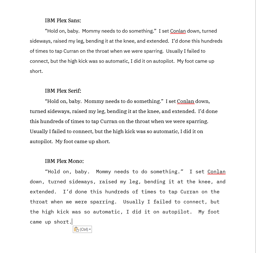
This is a jpeg, so there is some loss of quality. To see a png file, which is huge and might take longer to load, click here.
There are fifty million styles for each, medium, thin italics, etc. You name it, they made it. I think serif has possibilities. Opinions?
Click here to download IBM Plex.

Ooh a treat! I love hearing about Conlan.
Personally I’m a fan of the Sans.
Me, too. Sans all the way.
i like the mono.
Yea, the plex mono takes me back to my early days typing on an actual typewriter.
I like the serif better than the mono
I like serif the best it looks clean and is easy to read without taking up extra space in the margins.
I agree, the serif is better on the eyes when reading for prolonged time periods.
Sans or serif. The mono is curiously unappealing. Love hearing snippets. All this and a new house. We,re spoilt.
Serif
I love the sans. Clean, no fuss no muss, easy to read. Very nice font.
Thank you for posting this!
The mono reminds me of the old Smith and Corona manual typewriter keystrokes. Sans or serif look better to my eye.
yes! this exactly was what i was thinking. but i have a affinity for it for this reason. 🙂
Exactly.
I don’t like the mono. I prefer the serif as it seems easier on the eyes to read.
I liked the Sans. It was easier to read while scrolling.
Serif gets my vote. The little bit wider lines make the words easier on my eyes. Sans would be second.
I can’t resist new fonts, so I downloaded it. I don’t love the sans/serif better than what I’m currently using, but the mono earned a spot as my code editor font. We’ll see if it sticks. 🙂 Thanks!
Definitely prefer Sans. It has a cleaner look and is easier to read.
I like the mono. Can we please get a longer snippet?
Also will we hear about the old powers that are waking up?
Thanks for the snippet! Is Curran growing, or has Kate’s reach diminished?
I like the serif best, with sans in second place. Mono is too spaced out for me to read comfortably.
What Caramelia said…
I prefer Serif, it looks more novel-y to me for some reason. Sans looks like a business report. Mono gives a typewriter vibe
I can’t wait for this book! I’m not particular about the fonts but the content is awesome ?.
I preferred the sans, but then I also love the font Comic Sans.
Thanks for the Conlan blurb ?
This whole situation reminds me of the time that my former employer, Digital Equipment Corporation, was in deep financial trouble and invested in refining its logo and buying new business cards, envelopes and stationary for all of its employees. I never could understand why they chose to do that when there were other more pressing matters.
Fast forward to today. IBM has posted what is it, 22 quarters of declining revenue. Rather than addressing the necessity of improving its products or services, it instead invested in developing its on type faces.
Sell, sell, sell.
Yes, but we get a cool font out of it. 🙂
We totally had the “Oh, where were you in DEC?” conversation already, right?
Serif, any serif, just hurts my tired old eyes. Both the mono and the sans are so much cleaner and rounder, so my eyes don’t get as fatigued and I don’t find myself squinting. Actually I’ve found Opendyslexic to be the least fatiguing font for reading. I can even decrease my text size, my margins, and line spacing when using it.
I think it depends on what you want to use it for. I just took a class in user interface design and the user experience. On the internet and on computers, sans is better because it has a clean, crisp look. Easier to read on a screen. In a book, serif is generally better.
I agree. I used helvitica for years for technical documents as it had a good ratio of readability to space used. Because helvitica is not well supported anymore I have switched to calibri.
But for some reason a book in a sans serif font looks a little amatuerish to me so I vote for the serifs for Kate 10.
And thanks for the snippit! Now, just who was she kicking…
I’ve heard this as well, and I agree. On screen sans, on paper or Kindle paper, serif.
Serif all the way baby – easier to read
Serif for the win. The mono makes me feel like I am reading someone’s first draft, done on a typewriter . Or a book for children.
Serif then Sans. Mono was Bleh.
But We should probably have a bigger sampling… Like maybe a full chapter…. Then all of us could really decide!! 🙂
Oooh, aren’t you sneaky.
Here, here. A bigger sample for a more accurate response.
Sans
I’m with the sans group; it looks cleaner to me. Looking at the examples, the serif seems heavier or more cluttered, but I would prefer that over the mono. The mono is straight out.
I love the serif. I need to read quickly and serif makes this easier.
Sans for digital media, serif for print, imho. But we’re talking about YOUR writing here, so I’d read it in any font you chose to use!
True, regarding digital vs print, although in print you can switch the font in the reader. At least you can with the Kindle app. I’m assuming Kobo (?) and the others offer something similar.
To be honest, once you start reading, I think you automatically adjust and get used to do. To be honest, I couldn’t tell you what fonts were used in the previous books without having them in front of me. I can say that I think the Innkeeper series used a different font from Kate and the Edge books, but the Innkeeper is also a different sized book (between mass paperbook and hardcover), which is what I notice more. I still couldn’t tell you what fonts were used in that one. Not even sans vs serif.
I like the softer feel of the serif font. If that makes any sense.
Thanks for sharing
Speaking as one who has been “visually limited” for 50 years, sans fonts are easier on the eyes, less fatiguing, than serif fonts. All of my personal documents use sans. However, serif fonts are more elegantly formal. For the final copy of my best work, I would use serif. And gilded leather binding.
Typewriter fonts should not be used in novels unless the book itself is part of the story. I first-person narrative that says, “I am writing down my story on my trusty typewriter,” can use a typewriter font. I imagine that, if you attempted to make Kate sit at a typewriter, it wouldn’t go well.
I like the Sans format
I’ll take a snippet in ANY English-characters font!
Serif is so much easier to read
Serif looks closest to Times New Roman. I’m a traditionalist in some ways- I like these for business. The Sans looks closer to this typeface, so I equate it with a more casual look or feeling. Did IBM give a reason for the time and expense put in to these? Other than some publicity? Don’t know how this would advance them on the business front….
I wear variofocal glasses and serif is darker and cleaner for me.
Serif gets my vote.
And thanks for the snippet!
I hate the mono. Not something I would want to read very long. Of the other two I prefer the sans.
I like the mono. Easier for me to read.
But hey, I’ll take hand written, in crayon, on a napkin, if you’re sharing a snippet!
Concur.
Ummm. Hello? “My foot came up short” and then what? How short? What is it aimed at? What exactly is Kate doing. OMG. I have to wait for the book ?? authorlords i won’t tell anyone if you want to just slip me the full chapter .. Plus book is on preorder so.. Love getting snippets but now all day i am going to wonder.. What is kate kicking?
Serif for me. Like a previous comment, it is similar to Times New Roman, which I presently use and prefer.
Sans or serif. Serif gives a darker appearance, but both are quite acceptable. Mono is annoyingly spaced.
I like the sans, but if it starts with any of them, it doesn’t matter.
Serifs always!!!
I mean, I realize that means using more ink when printing, but serifs are just so much more attractive.
Sans is fine online (though I personally still prefer serifs), but if I’m reading, serifs make it feel like a real story.
I like pretty fonts but they are usually hard to read.
Ilona, I don’t mind which font you use…whatever makes you guys happy…but can we have a bit more of the snippet please?
“Please sir, can I have some more?”
Sans all the way! Clean and ready to read.
If I read in serif I get slight eye strain.
I like the serif. It’s easier for me to read.
Sans is the easiest to read
When I was an undergraduate (40+ years ago) I would have gone with the mono. Wrote a ton of 3 – 5 page papers. Sometimes needed that extra push of larger type on my Smith & Corona to make it to the minimum requirement when college life resulted in an all nighter to write a paper that was due the nect day.
When I went back to school 10 years ago, paper requirements had changed from specific number of pages to word count.
I agree. When I first started college, I had a Smith and Corona word processor/electric typewriter combo (yes this was one step up from the manual/electric typewriters), and the mono type font was a great way to get a minimum amount of words on a lot of pages.
Then, when I went back to school a few years later (started all over again), I saw on my class requirements not only minimum page numbers but also minimum word count. Made for some interesting times. 🙂
I’m surprised no one made reference to the SNL Ryan Gosling Papyrus skit. You should check it out if you haven’t seen it; it’s a hoot.
Alright, I had to check out the skit. That was funny. Who thought of that to make something of it??? Was original.
Well, just viewing the examples above, I like the Sans font best. I’ve always preferred a cleaner edge to the letters.
I find the serif easier on the eye to read.
Yes it is. I find it sustantial without taking up to much room. It is bold and solid yey compact. It gives the sense of a fountain pen, thin & thick without the tapering.
I don’t know why but for my eyes … I liked the serif.
Of course, then I wanted to read more about the kick.
IBM Plex Sans or Serif please.
Serif would definitely be my first choice, then Sans. Just couldn’t imagine trying to read an entire book in Mono!! YIKES!!!!
Loved how you also managed to slip us a little snippet in there too!! Not only are you a talented writer, but you are also pretty good at keeping the BDH poised and drooling in anticipation of the release of Kate 10!!! Thank you for the snippet! I love each any every bit I can get!!!!!
Mono has it’s uses! …specifically, if you’re doing something like code snippets, where uneven spacing is going to make everything a lot less readable.
I’m going to have to download these and play with them. I have deep and possibly unnatural love for Linux Biolinum, and use it wherever I possibly can. I use the complementary Linux Liberation family of fonts – which are really well constructed (and also open source) – when I need things a little more, er, normal, but I don’t have the same passionate attachment to them.
Yes, I like it the best. Easy to read and seems cleaner.
Doesn’t matter, if the cover says Ilona Andrews, I will read it; however, either Serif or Sans is ok with me.
IBM is still around?
Lol
Oh! Nice! I definitely like the serif best. More inviting!
Yes, Serif is my preferred version.
I like Serif too. It seems easier on the eyes and clearer.
Serif
Serif please!
Now I need to know who Kate was trying to kick? Pretty please?
Love, love, love to hear about Conlan….but what did Kate’s foot fall short of?
And i like Sans best..
Ya, it’s the font we’re paying attention to. Lol, You are a big tease!
I love your brain. If Serif is your happy font, rock away Authorlord.
Serif is easier to read and attractive.
I liked serif best
I prefer sans myself..I am curious though, does it makes a difference to your output if you use different writing during the process?
* fonts
It depends on the medium. I think the Serif would be cleaner and easier to read in hard printed style on paper, but the Sans would work better in the long run for reading on screen – easier on the eyes for long periods of time in a chunk. I’ve noticed on my e-reader that I can run the battery down using a Sans Serif font, but I have to rest my eyes more often and take a break from it with a Serif font. Not an issue with paper pages.